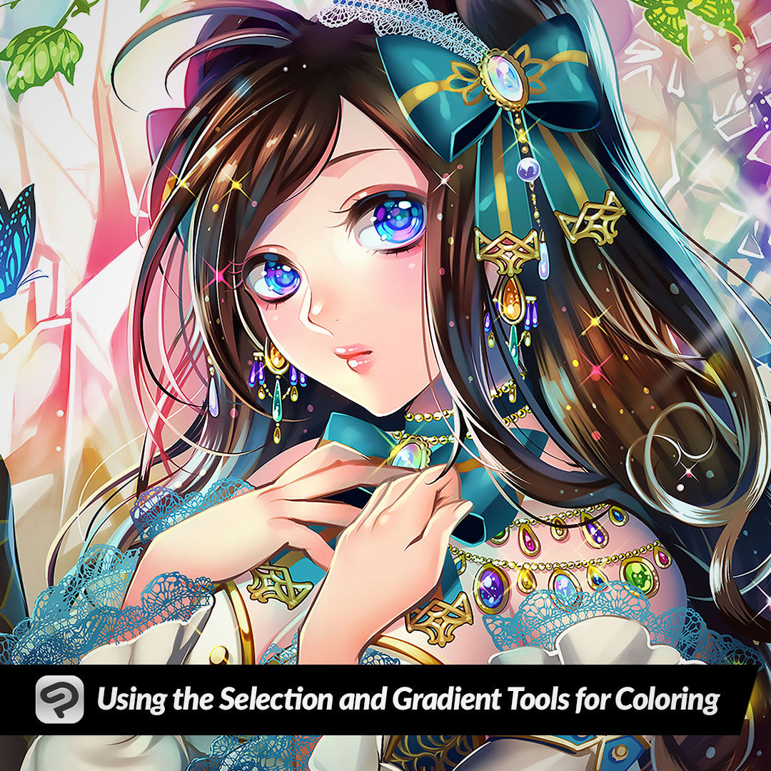
Using the Selection and Gradient Tools for Coloring
Contact Graphixly @
Hello! My name is Liz Staley and I’m a long-time user of Clip Studio Paint (I started using the program back when it was known as Manga Studio 4!). I was a beta-tester on the Manga Studio 5 program and for Clip Studio Paint, and I have written three books and several video courses about the program. Many of you probably know my name from those books, in fact. I write weekly posts on Graphixly.com and on CSP Tips, so be sure to come back every week to learn more Clip Studio Tips and Tricks from me!
This is one of my favorite ways to do shading because it’s a combination between soft shading and cel shading and I think it looks really pretty. And it’s pretty easy to do as well!
In this article we will cover the following topics:
Adding Depth with Shadows
Creating Highlights and Finishing Touches
Let’s get drawing!
Adding Depth with Shadows
To start, I laid down my flat base colors for the character. Then I create a new layer above the flat colors called “shadows 1”. Set this layer to multiply and then lower the opacity. I find that 50% is usually a good amount for a balanced lighting situation without very intense shadows.

For areas that I know are going to be completely in shadow, such as these bits of hair behind the neck, I usually just fill those in with a flat shading color before starting more complex shading. To do this, take the “Refer other layers” Fill tool, then set the Refer Multiple setting in the Tool Property palette to “All Layers” so that Clip Studio will take the line art layer into account. Then fill in any areas that are completely in shadow. I’ve chosen a deep purple color for my shading.

Now it’s time to start shading! I usually start with the face. Using the Lasso selection tool, draw out a shadow area. Keep in mind the direction that your light is coming from. The light in my drawing is coming from the left so I’m drawing around the shadow for the right side of the face.

Then select the Gradient tool and make sure the “Foreground to Transparent” subtool is selected.

Using the gradient tool, drag a line from the darkest part of the shadow over toward the lightest area.

If you got your gradient correct, you should have a shadow that fades just a bit as it gets toward the lighter area but still has a bit of a hard edge when you deselect the area.

Deselect the first shadow area and continue this process for other shadows on your illustration. I did the area under the bangs next. By the way, if you get a little missed area like above the right eye in my image, you can use the Liquify tool to push the shadow around to cover that area.

For tiny areas, such as under the nose and under the bottom lip, I like to make the selection and then use the fill option in the Selection Launch Bar to fill those areas instead of using the gradient tool.

Work your way around the image, continuing to draw out selections and use the gradient tool to make shadows.

Once I get the first round of shadows done, I like to create another shadow layer (again set to Multiply, opacity at 50%) and then add deeper shadows in certain areas. You can use the same color for this or even choose a different shade to add some more color variation.

The areas furthest from the light source or that are being blocked by other objects are great for this, such as the far side of the face, deep recesses of the hair, inside the ear, and below the arms. In the image below the left side is with just one layer of shadow, while the right has this second layer of darker shadows on it. Notice how much more “3D” the image on the right looks with the deeper shadows.

Creating Highlights and Finishing Touches
Now that the shadows are done, it’s time to add some final pops and finishing touches! For highlights, I make a new layer set to either Overlay or Soft Light. Lower the opacity of this layer as well. I did 50% but if you want your highlights to “pop” more, increase that number.

For hair highlights and highlights on shiny metal I like to use a hard pen tool or create selection areas and then fill them with white rather than using the gradient tool.

If you want to do some lighter areas you can use the same selection and gradient tool process, just make sure to select the areas close to the light source and fade the highlight toward the shadow side of the object.
For a final touch, I created a new layer on top of the entire image and filled it with a soft pink color. Then I set this layer to Overlay and 15% Opacity. This gives all the colors a uniform tone and brings the entire image together a bit. It’s subtle, but it does make a difference!

Conclusion
I absolutely love this way of shading and highlighting because I think it looks great and it’s pretty darn easy as well considering that you need to choose only one color and then use two tools. Once you get better at it you can flip between the selection and gradient tools quickly and finish shading an image in no time at all!
For more information on CLIP Studio Paint, please visit https://www.clipstudio.net/en or https://graphixly.com