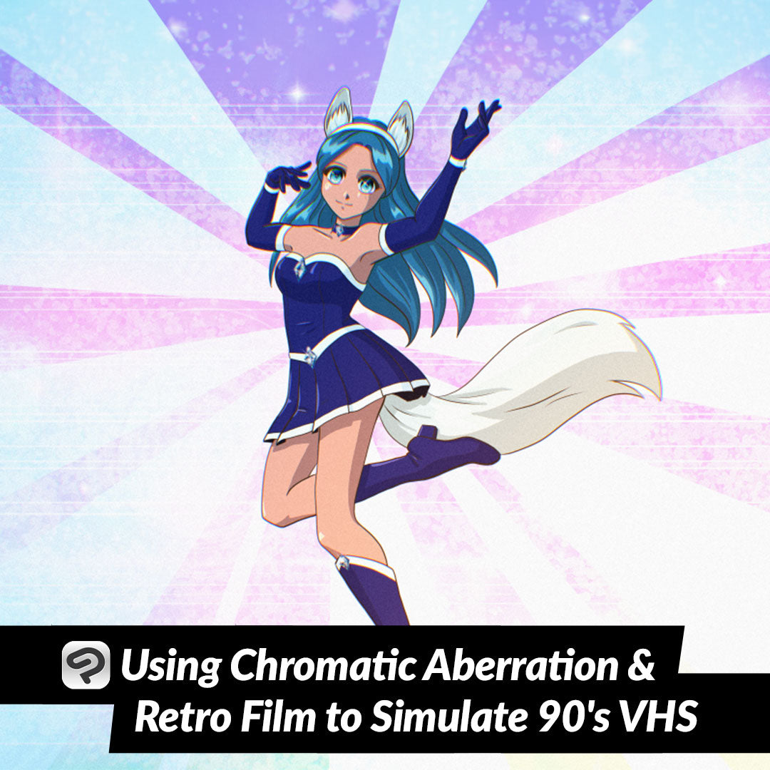
Using Chromatic Aberration and Retro Film to Simulate 90's VHS
Contact Graphixly @
Hello! My name is Liz Staley and I’m a long-time user of Clip Studio Paint (I started using the program back when it was known as Manga Studio 4!). I was a beta-tester on the Manga Studio 5 program and for Clip Studio Paint, and I have written three books and several video courses about the program. Many of you probably know my name from those books, in fact. I write weekly posts on Graphixly.com and on CSP Tips, so be sure to come back every week to learn more Clip Studio Tips and Tricks from me!
As someone who grew up on 80’s and 90’s anime, sometimes there is just something so charming about the look of an old show. From the drawing style to the film grain to the slightly off colors of VHS and CRT Televisions, there’s a look to retro anime that is distinct. So when I saw that Clip Studio Paint 3.0 was including a Chromatic Aberration and a Retro Film filter, I was excited to create something inspired by the 90’s anime I used to watch after school!
In this article we will cover the following topics:
Preparing Your Image
Chromatic Aberration Filter
Retro Film Filter
Let’s get drawing!
Preparing Your Image
For this example I decided that I wanted to do something inspired by 90’s magical girl anime like Sailor Moon and Cardcaptor Sakura. To make it seem more like a screenshot I knew that I’d have to use a 4:3 ratio for my canvas to match the televisions of the time, so I made a 4000x3000 pixel canvas at 300dpi so I could create my image at high quality.
I feel like if you’re trying to mimic the style of a certain era you should really look at a lot of reference from shows of that era. I quickly realized when closely looking at reference material that the animation of the time had very thin and fairly uniform lines, which is quite different from my normal inking style, so I had to keep that in mind as I inked and not use my favorite inking pen. You will also rarely find pure black or pure white in screenshots from the 80’s and 90’s, so I inked with a dark brown. Gradients were not used in this time either on figures because they were painted on physical cels with paint so I colored in a cel shaded style.

Before we start applying the filters we’re going to explore, I want to combine my image layers down to one new layer so that I can make changes to that without changing my original image. To do this, make sure that all the layers you want to combine are visible, then go to Layer - Merge visible to new layer.

Now you should have a new layer that is a combination of all the visible layers in your image. You can make edits to this layer while keeping the originals intact.

After looking at the final results for this article I probably also would have made another version of my image at a smaller resolution so that the filters were more noticeable when at the final export resolution. I would recommend this is you are wanting to really complete the retro anime look! Something like 1024x768 would be a great image size to downscale to before running your final filters.
With preparation out of the way, let’s move on!
Chromatic Aberration Filter
The first filter we’re going to explore is Chromatic Aberration. In very basic terms, Chromatic Aberration occurs when a lens fails to focus all colors to the same point. This leads to the different colors of light focusing at slightly different points and producing a color “fringe” effect. This would happen quite a lot on old TVs and poor quality VHS tapes!
It used to be a pretty complex process to fake Chromatic Aberration in CSP, but now there is a handy filter that makes the job easier! This filter does not add film noise so it can be used to create the aberration look without adding grain to your image (handy if you want to create a glitch effect!)
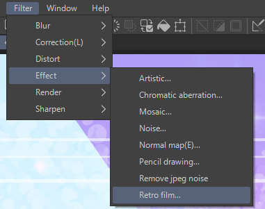
Click of Filter - Effect - Chromatic Aberration.

The Chromatic Aberration option window will come up with the default options filled in already. By default it is set to “Radial (use center point)” for the Mode.This will use the center point of the image as the center of the color fringing. Notice how in the screenshot below the red lines are on the right side of both the character’s arms but they are on the top of the headband.

Let’s change the mode to Lateral instead. Now CSP will use the value set in the Angle slider as the angle for the aberration effect. In the screenshot below you can see that the color fringing is going straight across at a 90 degree angle.

Taking the Intensity up changes the distance that the red, blue, and yellow colors are from the original image and each other.

While lowering the Intensity value makes the effect very subtle.

As mentioned before, changing the Angle value will adjust the angle of the color fringe effect. In the screenshot below the red color is on the right of the lines.

Where as in the next screenshot the red is on the left side because the angle has changed.

Remember to zoom out to check how the effect looks when at a smaller size. Unless you’re going for a specific sort of look, a subtle amount of aberration is usually all that’s needed to make something look retro.

Retro Film Filter
Now that we’ve talked about the Chromatic aberration filter, let’s explore the Retro film filter. This filter allows us to add film grain as well as chromatic aberration, so using both this filter and the Chromatic Aberration one is not necessary.

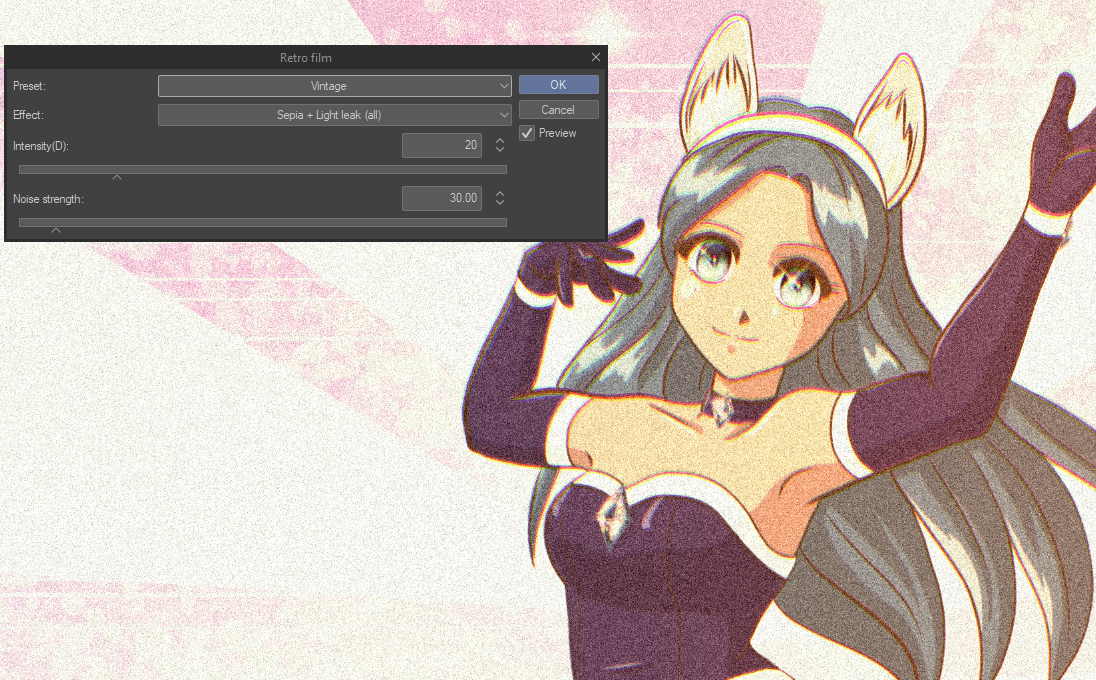
There are several presets in the Retro film filter, including a beautiful Vintage preset that makes a sepia toned image with an old-timey feel.

Since I want to play around with the settings on my own I change the prest to None and then the Effect to “Light leak (slant)”, which allows us to add chromatic aberration and film camera noise at the same time.

In this mode as well as the previous filter, changing the intensity down moves the light fringing closer to the origin lines and makes the effect much more subtle.

And increasing the Intensity slider makes the “light leak” colors much farther apart and more obvious.

Noise is the bits of different color that happens in old film cameras, and adding some Noise can make the retro effect more convincing. Taking the Noise strength slider all the way up almost makes the image unrecognizable.

But making the Noise strength value too low nearly eliminates the Noise altogether.

Remember to zoom out to check your results at a smaller resolution, especially if you are working on a 300dpi canvas or larger.

To check how the image looks without the filter you can uncheck the Preview box to view the original image. Check the box again to compare and adjust your filter settings if needed.

Zooming in on the image with the values that I used in the screenshot above you can see that the result looks quite good!

However, I did try again with a lower resolution file of the same image and was able to create an even better looking version with the same filter. So if you aren’t getting the results that you’re looking for, try resizing your image!

Conclusion
I think these two new filters are great additions to Clip Studio Paint and can be applied in so many different situations to achieve all kinds of looks. I’m really excited to use them some more in the future!
For more information on CLIP Studio Paint, please visit https://www.clipstudio.net/en or https://graphixly.com
1 comments
Fourth image after the banner: If you have the old red/blue style 3D glasses put them on while viewing that image of the lateral mode. It’s a secret bonus tip for making old style 3D images she wasn’t even planning. :D