Transform Your Illustrations to Pop Art
Contact Graphixly @
Hello! My name is Liz Staley and I’m a long-time user of Clip Studio Paint (I started using the program back when it was known as Manga Studio 4!). I was a beta-tester on the Manga Studio 5 program and for Clip Studio Paint, and I have written three books and several video courses about the program. Many of you probably know my name from those books, in fact. I write weekly posts on Graphixly.com and on CSP Tips, so be sure to come back every week to learn more Clip Studio Tips and Tricks from me!
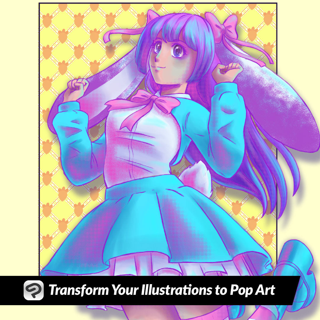
Pop art is a colorful art movement from the mid-20th century. It incorporates imagery from popular culture (hence the name!) and mass media, including comic books and advertisements. It is characterized by bold colors and techniques like screentone patterns and collage. This week, I’m going to take one of my illustrations and turn it into a bright and colorful Pop Art inspired illustration, and show you how easy the process is! So if you’ve ever wanted to dabble in the world of super colorful and bold pop art, read on!
In this article we will cover the following topics:
Choosing a Color Palette
Adjusting Shadows and Highlights
Adding Screentones
Let’s create fun and colorful art!
Choosing a Color Palette
For this example I will be taking a previous illustration I’ve made and turning it into Pop art by changing up the colors and adding screentones. To start off, I want to pick out a color palette that I like. So, with my image open, I googled “Pop Art Color Palettes” and considered a few different ones before settling on one that I thought would do well with the image.

I copied the palette image and pasted it into my Clip Studio Paint canvas.

Next I used my chosen palette to replace the colors in the image.

Adjusting Shadows and Highlights
Since I’m adjusting an existing illustration, I’m going to adjust the existing shadows and highlights to fit the new color scheme. Below is the new color scheme with the old shadows on it, and you can see how they don’t fit with the bright and bold colors!

On the shadow layer, click the “Lock Transparent Pixels” icon, then fill with a complementary color shadow. I chose a light purple color, with the layer set to the Multiply layer mode and 75% opacity.

Then I used the technique from a previous week’s article to do some color correction to the shadows as well. If you missed that article, you can read it at the link below!
https://tips.clip-studio.com/en-us/articles/11168
This makes the shadows look a bit more natural but they’re still pretty bold.

For my highlights I used the same highlight layer from my original image, but filled them in with a bright cyan blue and set the layer blending mode to “Hard Light”.
Adding Screentones
A lot of pop art incorporates parts of commercial art, including comic book screentones, which are the patterns of dots in comics and manga that act as shading. You can create screentones with materials in Clip Studio Paint, but if you don’t want to make selections or erase materials by hand, there’s another way that we can add some screentones using Layer effects and the airbrush tool!
Create a new raster layer. Then in the Layer Property palette click on the Screentone icon. I set the Frequency on mine to 30, but you may need to change this setting depending on the size of your canvas. For Density, choose the “Use brightness of image” setting. If you want a pattern other than dots, you can change the Dot Settings to another shape.

Next select the Soft Airbrush tool and make black your active color. Use the Airbrush tool over the areas where you want to add screentones. I chose to go over some of my shadow areas. Because we’re using the soft airbrush the screentone pattern will react accordingly and gradient out depending on the pressure you apply with your stylus.

Add screentones where you like. Then once you’re done, right-click on your screentone layer and select “Rasterize” from the menu.

After your layer is rasterized, click on Edit - Convert Brightness to Opacity.

Now you can use a brush or pen tool over your screentones to change them from black to a contrasting pop art color. I used dark purple, pink, and cyan for my colors.

Conclusion
Pop art is a fun and colorful style that’s a blast to incorporate into your illustrations, especially if you like bright colors and collage!
For more information on CLIP Studio Paint, please visit https://www.clipstudio.net/en or https://graphixly.com