Tips for Drawing Dynamic Poses
Contact Graphixly @
Hello! My name is Liz Staley and I’m a long-time user of Clip Studio Paint (I started using the program back when it was known as Manga Studio 4!). I was a beta-tester on the Manga Studio 5 program and for Clip Studio Paint, and I have written three books and several video courses about the program. Many of you probably know my name from those books, in fact. I write weekly posts on Graphixly.com and on CSP Tips, so be sure to come back every week to learn more Clip Studio Tips and Tricks from me!
The ability to draw dynamic poses can bring one-off illustrations as well as comics to life! But how can you make your poses more dynamic? In this post I’ll share my top 5 tips for creating more dynamic poses in your art.
In this article we will cover the following topics:
Avoid Symmetry
Identify the Line of Action
Mind the Center of Gravity
Add Secondary Action
Use 3D Models
Let’s get drawing!
Avoid Symmetry
Symmetry is when something is the same on both sides. Now there are times where you may want to have symmetry in your drawings, such as if you are creating a basic character reference sheet that just needs to show how the character looks.
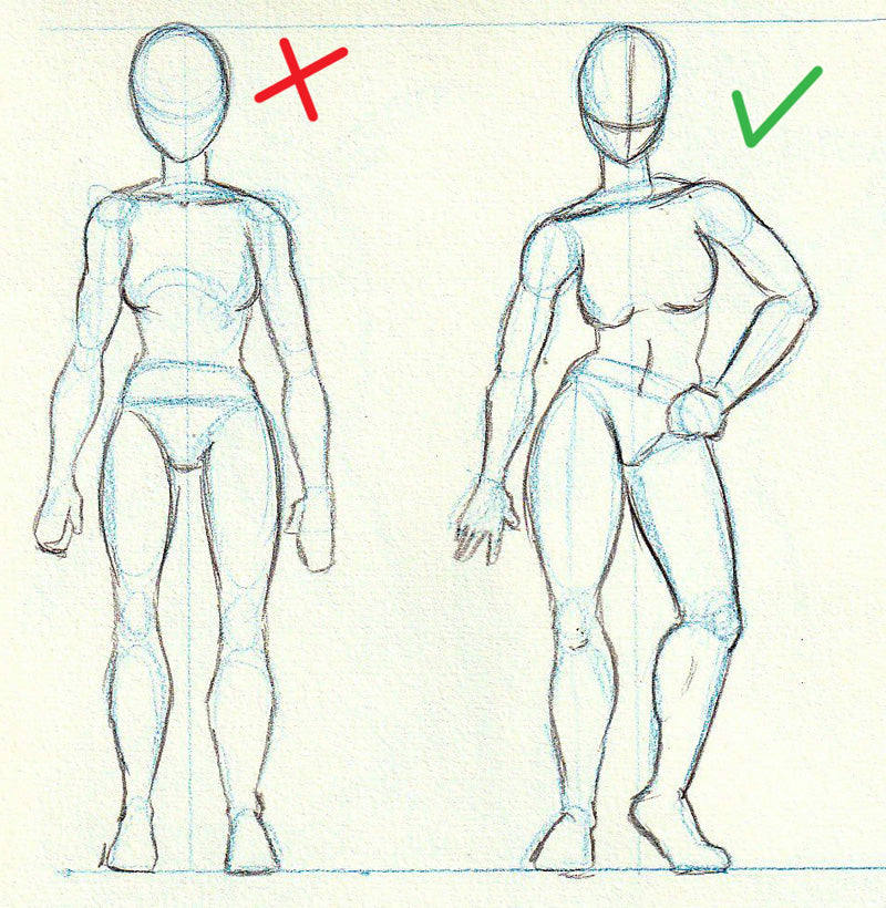
However, an asymmetrical pose shows a lot more attitude and personality than a straight-on pose where both sides are the same. In the example below, notice how the pose on the right has the shoulders and the hips angled in opposite directions.

Something as simple as tilting the shoulders and the hips at opposite angles brings out a lot more character in the pose and makes it much more interesting to look at.
Angling the shoulders and hips is a great rule of thumb to remember. Make sure to look for this tilt when looking at reference images or when creating your own poses.
Identify the Line of Action
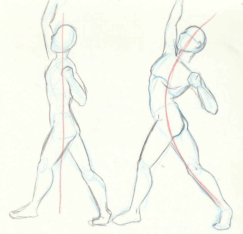
The Line of Action is a line that runs through the pose, usually along the character’s spine. In both the uppercut poses below, the red line is the line of action. Notice how much more dynamic the pose on the right looks than the one on the left.

You can even apply this rule of thumb to poses that aren’t super lively to make them look more natural. For instance, the line of action in the reclining pose below is more gentle, but the curve of it makes the pose look more dynamic.

When working from reference, identify the line of action of the pose early on, even if you don’t actually draw it out when you start sketching. Note that usually the line of action will continue through an arm or a leg to make the overall pose.

Mind the Center of Gravity
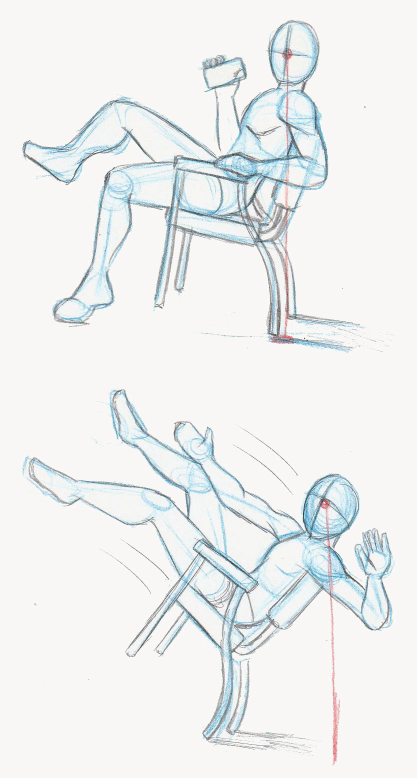
The Center of Gravity or Center of Balance is an imaginary point on your figure, usually the head or the center of the chest, where the balance is concentrated. If this point gets too far in front of or too far behind your character’s feet (or some other point, like in the examples below) then it will look like they are about to fall over!

You can think about it like leaning back in a chair. Have you ever leaned too far back in a chair and ended up on the floor? That’s because your own center of balance got too far behind the chair’s legs and the only place to go was backward! In the examples above we can draw a line from the middle of the face down toward the floor. So long as something is supporting the character where that line meets the ground (or relatively close to it!) then the character is balanced. But if the line gets too far from support of some kind then the character will look unbalanced.
You can use this rule to your advantage when you want to draw a character that is falling over, too!
Add Secondary Action
In animation, secondary action is what we call action that is a result of the primary action. For instance, if a schoolgirl is running then her hair and any loose areas of her clothing would be moving in the opposite direction of her forward momentum.
Search for any areas where you can add secondary action and flow to your poses. In the examples below the black lines show the main part of the action, while the red shows the secondary action areas.

I especially love drawing hair flowing in secondary action, but in the case of a character with short or tightly bound hair, you have to add other things to create the secondary action, such as with the ballerina in the top right pose.
Use 3D Models
The best way to draw dynamic poses, especially if you don’t have a lot of practice with them, is to use reference! Real-life observation and photos are great, but sometimes it’s impossible to find the pose you want from the angle you want it at.
This is why I love CSP’s 3D models so much! You can pose them in whatever way you need to, and then move the camera so you always get the perfect angle. I have an article already about how to pose 3D models which you can find here:
https://tips.clip-studio.com/en-us/articles/3627
However, something not covered there is the Manga Perspective feature since it was not out yet. The Manga Perspective feature allows us to exaggerate the foreshortening on our 3D model. Foreshortening is when a body part appears larger or smaller depending on how close it is to the viewer, and in manga it can be used to really make your character look like they’re popping off the page!
Below is a pose of a character reaching forward toward the viewer without the manga perspective turned on.

In the Sub Tool Detail window with the 3D model selected, we can click on the Manga Perspective category and then check the box next to “Manga Perspective” to turn the option on. In the screenshot below the camera and the model haven’t been changed at all, but notice the difference in the hand! CSP is automatically exaggerating the part of the model closest to the camera so that we have that extreme foreshortening seen in a lot of manga.

Turning the Manga Perspective option on will make the exaggerated foreshortening change depending on the position of the camera, so be aware of this if you make changes after checking this box.
Conclusion
Hopefully these tips help if you are unsure of how to start making your poses look more dynamic. Remember though that one of the best ways you can make your art more dynamic is to keep practicing and pushing yourself to improve!
For more information on CLIP Studio Paint, please visit https://www.clipstudio.net/en or https://graphixly.com