The 1-2-3 Shading Method
Contact Graphixly @
Hello! My name is Liz Staley and I’m a long-time user of Clip Studio Paint (I started using the program back when it was known as Manga Studio 4!). I was a beta-tester on the Manga Studio 5 program and for Clip Studio Paint, and I have written three books and several video courses about the program. Many of you probably know my name from those books, in fact. I write weekly posts on Graphixly.com and on CSP Tips, so be sure to come back every week to learn more Clip Studio Tips and Tricks from me!
Even after so much time as an artist and using Clip Studio Paint, I still love learning new methods to create art! So when YouTube suggested to me a video by a user named oridays called “How to Shade Like Japanese Artists - The 1/2/3 Shadow System [TUTORIAL]” I clicked on it to see if the method was of any interest, and the moment that the video finished I knew I wanted to try this technique out! I feel like anyone who is having trouble with their coloring should give this method a try to see if it leads you to a breakthrough, because both my experiences with the 1-2-3 method have been pretty awesome compared to my regular color method.
In this article we will cover the following topics:
The 1-2-3 Shading Method
Let’s get drawing
The 1-2-3 Shading Method
I recorded a timelapse of working on this image that you can watch below, but I have also outlined the steps I followed below.
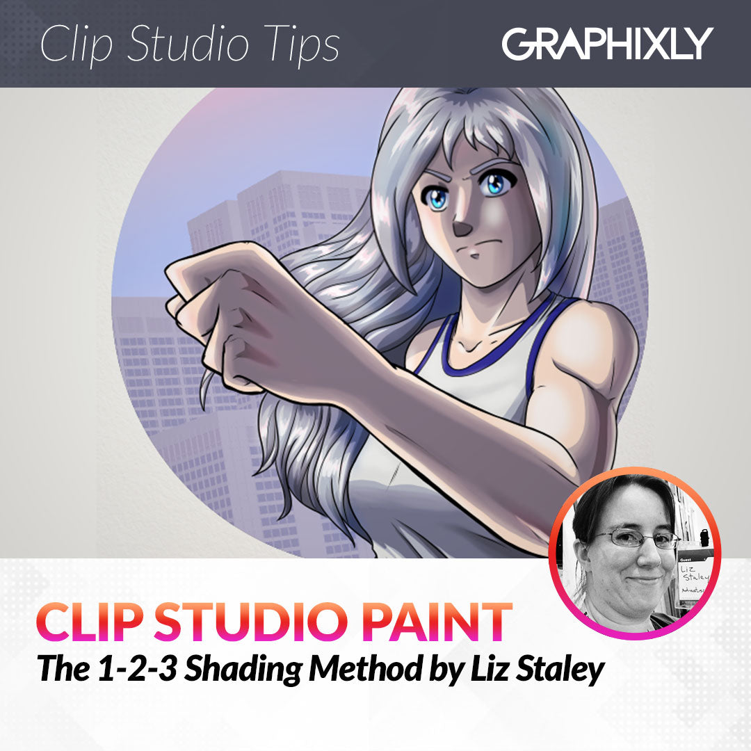
To start, I created a canvas and drew out my image. My ink lines are all on one layer at the top. I’ve made the Paper layer a blue-green color just so I can see the light parts of my character more clearly (since her clothes are mainly white!)
While on my inking layer I used the Auto Select (magic wand) tool to select all the parts of the image outside of my character.
With the selection still active, I created a new raster layer BELOW my inks layer and named it “White base”. Then I clicked on the Invert selection button in the launcher bar, marked below by the red square and arrow.
Now instead of the area outside of the character being selected, my character is selected. We could do our white fill now, but we risk having a little white ‘halo’ around the edge of the character because of the selection area being on the outside of the character lines. To fix this, click on the Shrink Selection icon in the launcher bar, marked in the red square below.
The Shrink selected area window will come up. The number of pixels you use in the top text box will depend on your image and the width of your lines. I usually ink with fairly thick lines, but this time I tried to use thinner lines, especially on the main part of the character. So I decided on 2 pixels. Click OK.
Now, with the white color as my active color, I clicked the Fill icon in the launcher bar below my selection to fill the selection with the flat color.
In this 1-2-3 Shading Method, we will actually do all the shading on our image before adding any color. I found this really helpful because it allowed me to concentrate on the contrast between shadows and the shape of the shadows without worrying about the color as well.
For the lightest shadow, or Shadow 1, I copied my White base layer and then changed the white to a light blue-gray color. Then, using the Lasso marquee tool and eraser tool, I “carved” the shadow color away from the areas where I wanted the light to be hitting in my image. 
With the shape of my first layer of shadows figured out, I then created a new raster layer named “Shadow 2” and chose a darker shading color. Then, using the Lasso marquee tool and my favorite pen tool, I filled in areas of darker shadows that are further from the light source, such as the far side of the face and hair, the underside of the hair that goes back behind the neck, and along the forearm where the arm is blocking most of the light that’s coming from the left side.
In the oridays YouTube video that I mentioned at the beginning of this article, they have the following step happen at the end of the process. However I found it helpful to do this step now instead. This is the “Shadow 1.5” which is a slight shadow that is a shade between Shadow 1 and Shadow 2.
I made a new raster layer for this shadow and chose a midway shade. Then I used it on areas where there was a large space between the edges of Shadow 1 and Shadow 2. This was also when I realized that I didn’t like my Shadow 1 color, so you’ll see it change in the next few images.
Blend the edges of Shadow 1.5 if you wish to. I just used the Blend tool and went over the edges to soften them and make the transition more gradual.
Finally, let’s add Shadow 3. I started this with another new raster layer. Then I selected the darkest shadow color and used the Lasso Marquee tool and a pen tool to mark out the areas of deepest shadow. This is usually areas where objects overlap, such as cast shadows from the hair on to the face, on the deepest parts of the clothing folds, in the hair near the neck and close to the body, and underneath the chin.
Now that our shadows are figured out, we can start adding the colors to each part of the image. I decided to put my shadow layers in their own layer folder, then created another layer folder called “Local Colors”. Set this layer folder to Multiply. Then create a new raster layer in the folder for each part of your image. I made a layer for hair, skin, clothes, and the trim on the clothing. I’m going to be coloring the eyes separately so no layer for those yet.
I then filled in the color for each portion of the character on the corresponding layer. It took me awhile to realize I missed filling in the bottom of the hair, but I corrected that later once I realized that it didn’t look right
Because each of the color layers are set to the Multiply blending mode, the local color will react to the shadow colors below it and will automatically shade itself depending on the colors and shapes of the shadow layers.
With the bulk of the shadows and the base colors figured out, we can start adding the finishing touches. I don’t have the space to go in to every step of the process I went through here because this is already getting quite long, but I will briefly explain what I did in each stage.
I created a layer folder for the Eyes and then painted them on their own layers, including layers set to multiply to provide shading and a layer set to glow dodge to almost make the blue look like it’s glowing. In the hair, I created a highlight layer set to screen and added some light pink highlights for added warmth in the hair.
I added some more cool colors in to the hair, as well as lighter highlights to add some shine. At the bottom of the bangs and also where the hair is closest to the neck and shoulders I added a little bit of the skin color with the soft airbrush to make it look like the hair is reflecting the color of the skin. In the screenshot below is the finished hair and the layers used to create it. You can also watch the time lapse shown at the beginning of this section to see how this came together.
I added some layers to add highlights to the skin. Make sure to also highlight the clothing as well! It is also helpful to make a layer on overlay or Screen and add some pink areas to the skin, such as on the cheeks, the tip of the nose, elbows, knees, and knuckles. I set this layer to about 15% opacity so that it would just be a touch of color to add some interest and realism.
Next I added a Gradient Map Correction Layer under the ink layer and over all the coloring layers. This allowed me to tweak the colors slightly and unify the colors a bit more. After adding this correction layer I set the layer to Soft Light and 20% opacity so that it is just a hint of color.
For more details about gradient maps, refer to this previous article from me: https://tips.clip-studio.com/en-us/articles/7133
Finally I added a little bit of a background just to add some interest to the character portrait and signed my work.
Just a reminder that there is a timelapse video of this image being created that you can watch at this link: https://youtu.be/yNDDnda7mPc
I also highly recommend checking out “oridays” on YouTube and watching their video about this method. They go into much more detail about their finishing methods and the video is less than 10 minutes long.
Conclusion
I’ve been coloring in the same way for a long time but I’m going to be doing this method a lot more often! It was so helpful to concentrate on the shadows and the contrast between the shadow areas before adding the colors in. If you’re struggling with shading, try this out and see if it helps!
For more information on CLIP Studio Paint, please visit https://www.clipstudio.net/en or https://graphixly.com