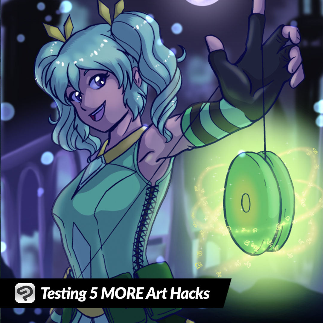
Testing 5 MORE Art Hacks
Contact Graphixly @
Hello! My name is Liz Staley and I’m a long-time user of Clip Studio Paint (I started using the program back when it was known as Manga Studio 4!). I was a beta-tester on the Manga Studio 5 program and for Clip Studio Paint, and I have written three books and several video courses about the program. Many of you probably know my name from those books, in fact. I write weekly posts on Graphixly.com and on CSP Tips, so be sure to come back every week to learn more Clip Studio Tips and Tricks from me!
I had so much fun last week testing out art “hacks” that I wanted to try five more I’ve seen and wondered if they worked! So let’s try out some more new techniques.
In this article we will cover the following topics:
Easiest Ambient Light Ever
Clean Up Paper Sketch in Seconds
Simple Harsh Lighting
Adding Texture
Easy Nighttime Scenes
Let’s get down to business!
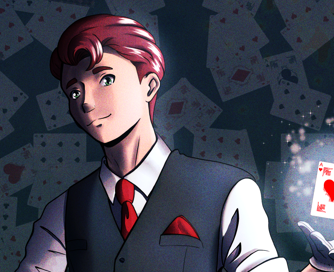
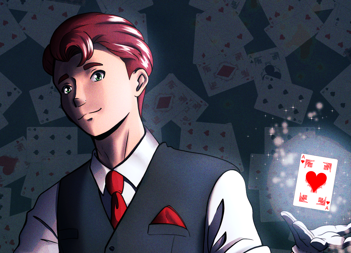
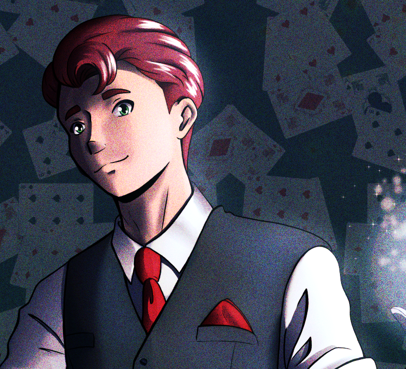
Easiest Ambient Light Ever
Let’s start with this trick I saw for adding ambient light to an image that I thought looked interesting (and since I’ve never really totally understood how to add nice ambient light, I thought it would be a good one to try to improve my work!)
If you are going to be applying ambient light to an entire image, skip these next steps about selecting the character and go right to adding the gradient.
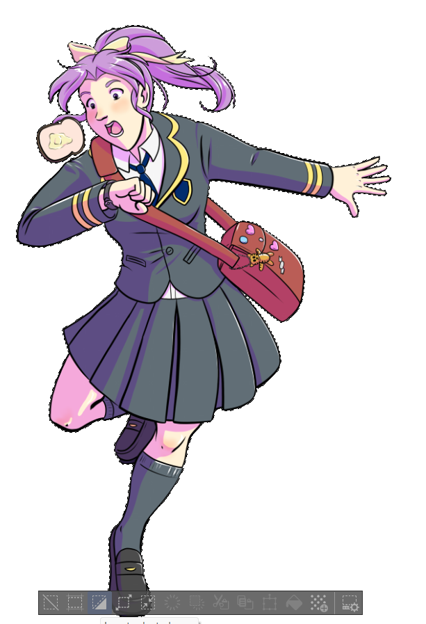
To apply the light to only my character, I used the Wand selection tool to select the white space outside of my character.
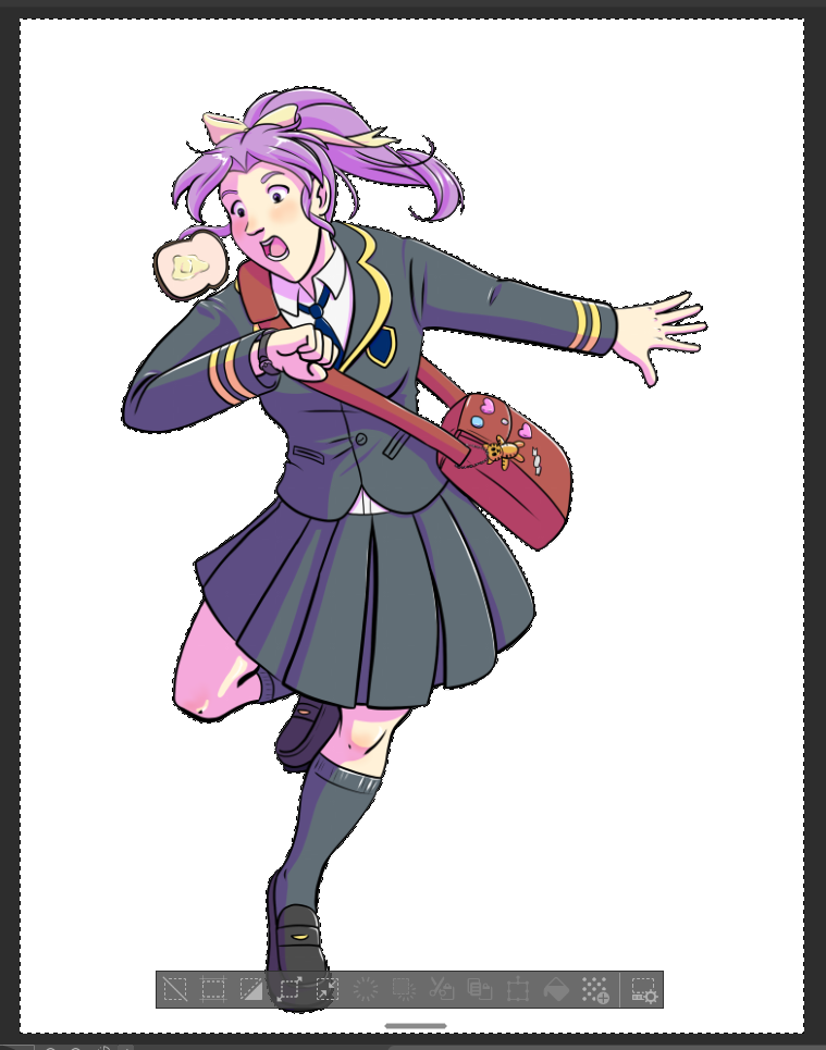
Then click on the “Invert Selection” icon in the launch bar at the bottom of the selected area to select the character.
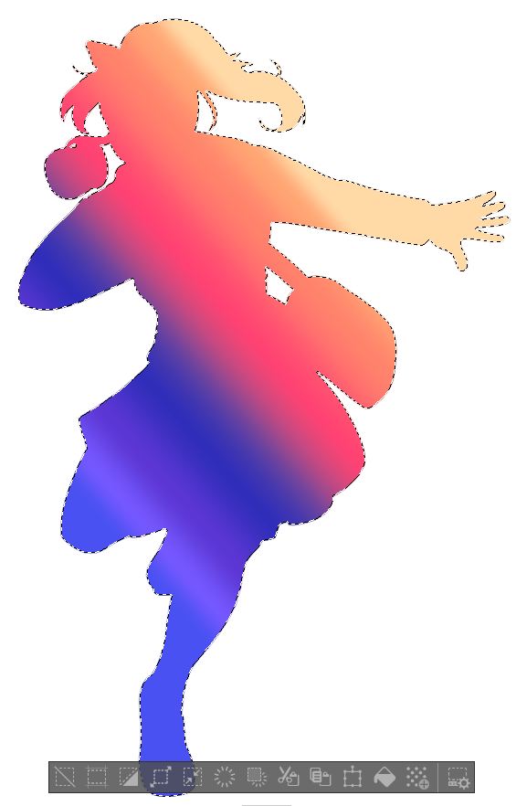
On a new layer above your other layers, apply a gradient inside of the selection. Make sure that the darker area of the gradient is on the side of your image with shadows. If you’re not sure what sort of colors you want, you can find a lot of pretty gradients on Clip Studio Assets that you can download and load into Paint!
Deselect the character area. Then make a copy of the gradient layer. You are going to want to set the top gradient layer to the Overlay blending mode at 20% Opacity. Change the lower gradient layer’s blending mode to Multiply.
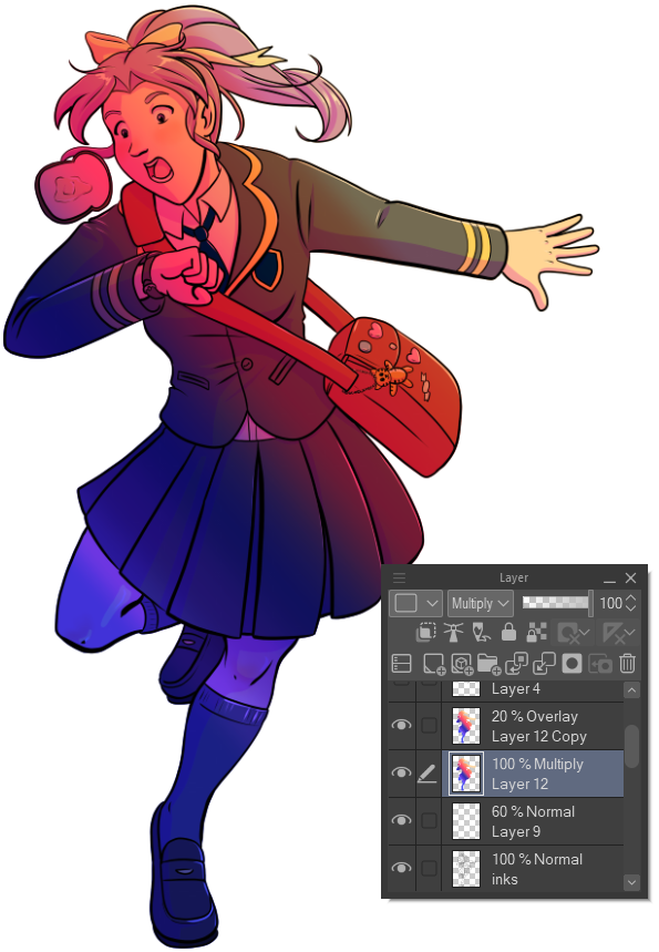
Use a soft eraser to erase away the highlighted areas on the Multiply gradient layer.
Lower the Opacity of the Multiply layer. I changed mine to about 50% opacity.
Make a new layer above the line art layer. In the Layer palette, right-click the new layer and click on Layer Settings - Clip to Layer Below. This will restrict our next step to only the line art.

Use the Soft Airbrush to lightly brush a lighter color on the lineart in the lighter areas and a dark color in the darker areas. I used a golden yellow color on the brighter areas and a dark purple in some of the shadows to add some variation.
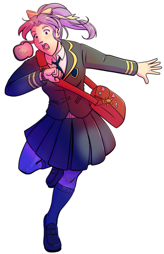
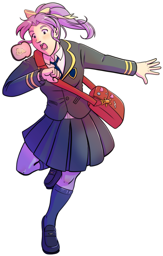
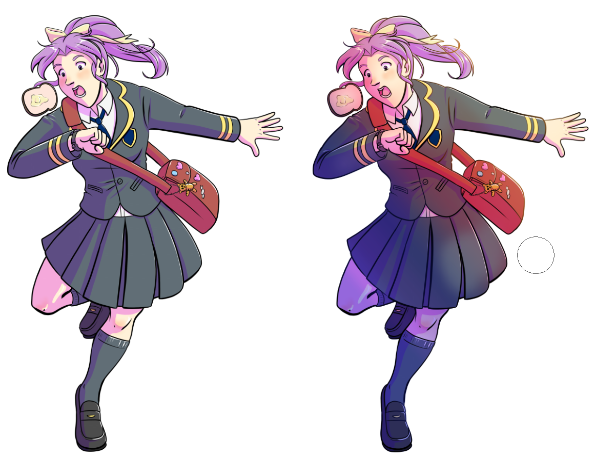
Below you can see the original version of my drawing on the left and the changed version on the right. I actually really like this technique because it adds some variation and ties the image together but is very easy to pull off!
Clean Up Paper Sketch in Seconds
This next technique is so easy that it seems like magic, so I had to try it out for myself just to see how well it actually works! This is for those paper sketches that you have a poorly lit photo of with a gray background instead of a nice white paper color!
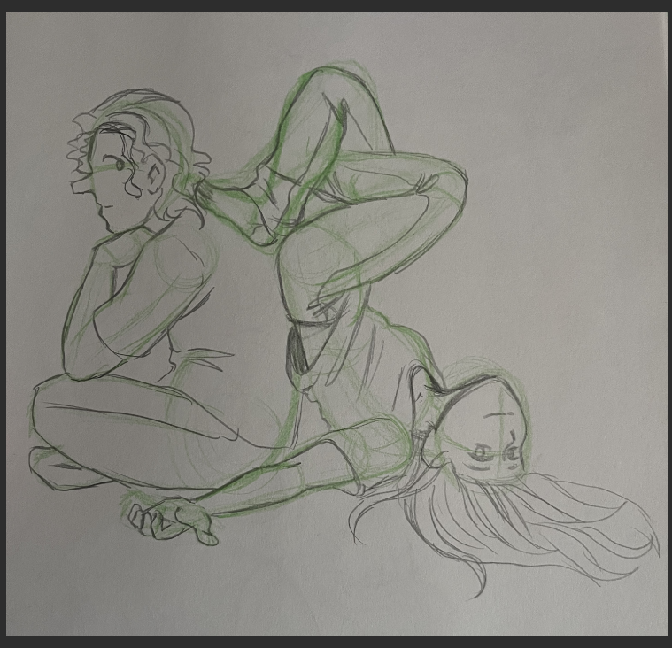
Create a new layer above your paper sketch photo layer and right-click it, then go to Layer Settings - Clip to Layer Below. Set the empty layer’s Blending Mode to Divide.
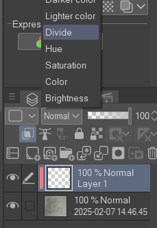
Now use the eyedropper tool to select the gray color of the paper in your sketch photo. Fill the Divide layer with this color and watch as the gray turns to white!
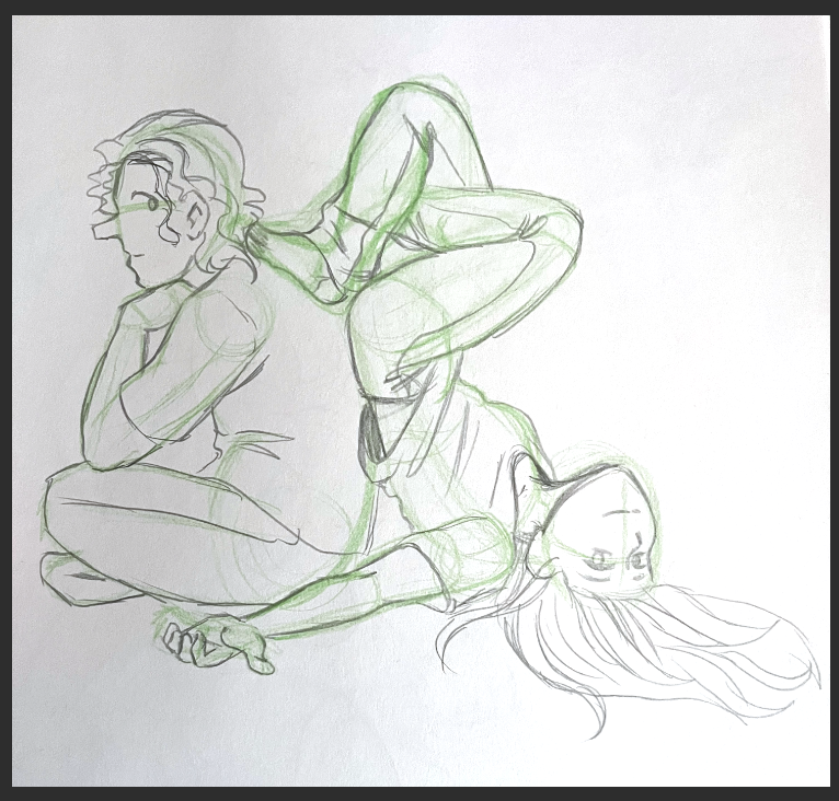
I had mixed results with this one, probably because I had a shadow on the left side of my sketch photo. If I managed to color pick the darker gray from the shadow and fill with it, then the left side of the sketch was completely gone, but using the lighter gray from the majority of the background still left some of the shadow on the left. I think if you were more careful about shadows on your image though that this trick would work wonderfully - and it’s a lot faster than messing about with the Brightness/Contrast and Levels!
Simple Harsh Lighting
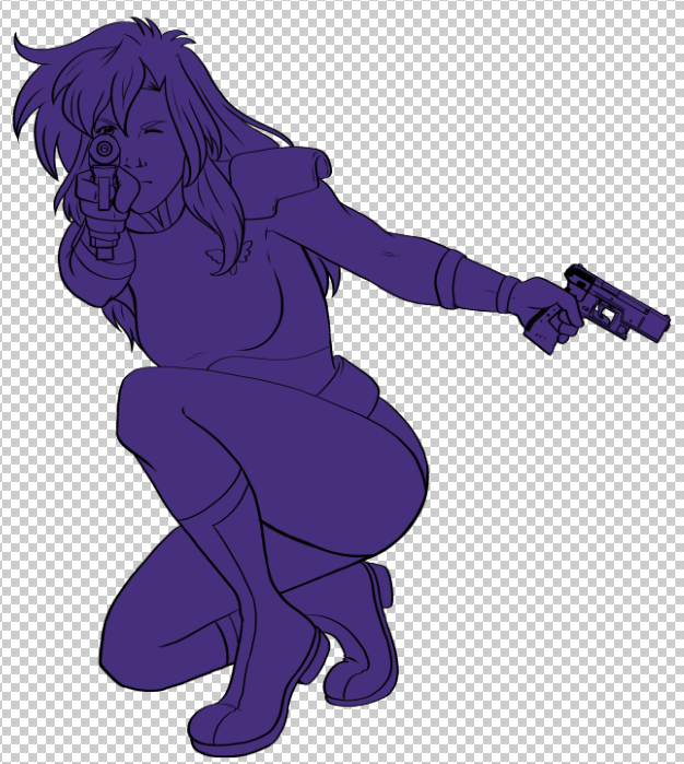
I really love a nice harshly lit, dramatic scene, so when I saw this method for creating that look I knew I had to try it! Start off by filling in the silhouette of your character with a gray color on a layer below your lineart.
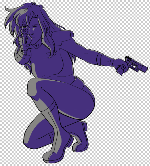
Now make another layer and fill that silhouette with a dark purple or blue color. I just copied the gray layer and changed it to purple.
Erase the purple layer where the light is hitting your character. Once you’ve finished, change the blending mode of the purple layer to Multiply.
On a new layer, use a light blue color to add light along the back of the character to bring out more details.

Fill in your base colors for your character on the gray layer.
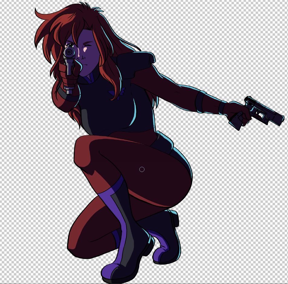
Lower the opacity of the purple layer. The lower the opacity, the less dramatic the shading will be!
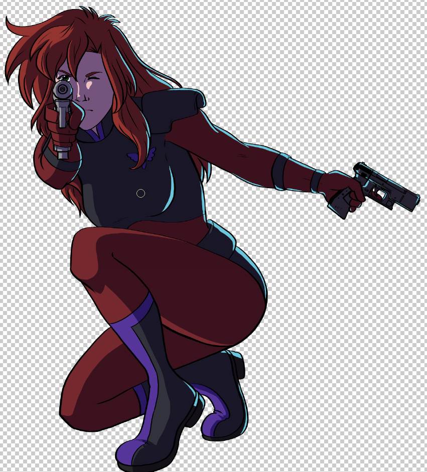
Next create a new layer and set it to Color Dodge. Use the Soft Airbrush to add a warm highlight color such as yellow or orange, to the light areas of your character.
On the left below is the version of this image from when I first created it, and on the right is the new version. I feel like the original version looks a bit better because of the extra shadow layer on it that makes it a bit more dramatic.
Adding Texture to Your Images
Our next technique is an easy way to add texture to an image. To start, create a new layer and fill it with a medium gray color.

Now we’ll add some texture by going to Filter - Effect - Noise.
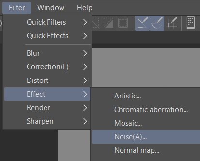
Adjust the strength and the color mode. The color mode will put specks of color through the noise, however if you want a monochrome texture you can change the color mode to Gray.
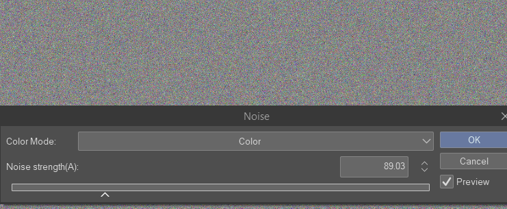
Change the noise layer’s blending mode to Overlay.
Next adjust the opacity.
Note that if you want the texture effect to be more pronounced, you should make the image smaller before completing these steps. This way the noise particles will be larger.
Below, my original image is on the left and the new version is on the right. This is another effect that I feel would work in certain circumstances but that I probably wouldn’t use on every drawing. If it matches your style and you love it though, it’s a very easy way to add some nice texture to a piece!

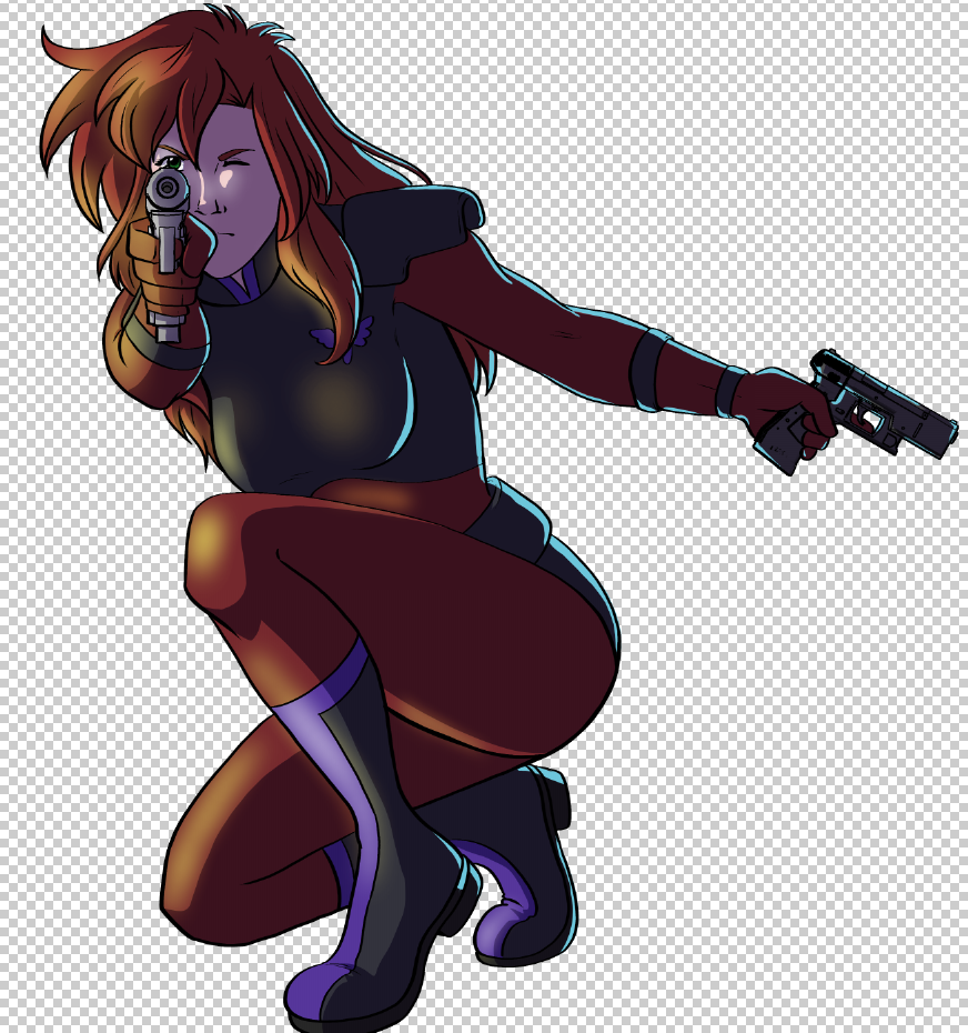
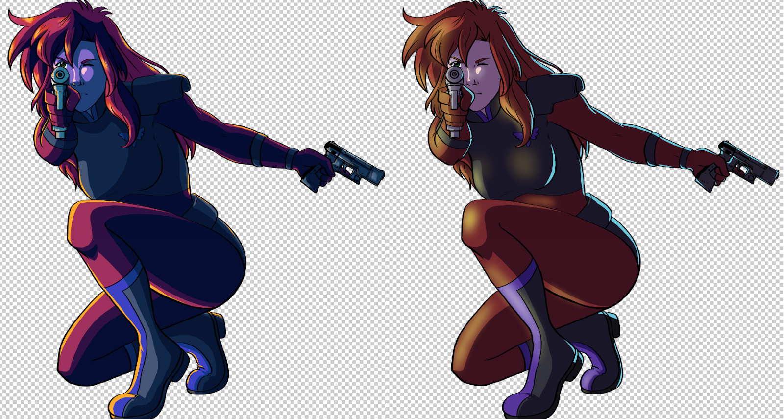
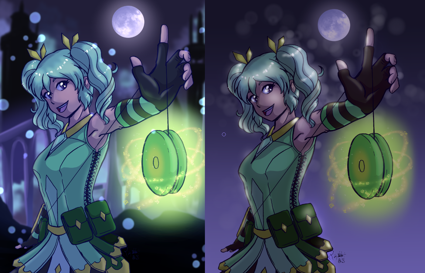
Easy Nighttime Scenes
I really like playing with colored light and nighttime scenes, but one of the neat things about this technique we’re going to try out is that you can add it to an image that you’ve colored as though it’s regular lighting! So let’s start out with this image that’s a bit on the “cooler side” of coloring, but just know that you can use this on any shaded and highlighted image you’ve already made.
Make a new layer at the top of your image and fill it with dark blue or purple. Set the layer to multiply and lower the opacity.
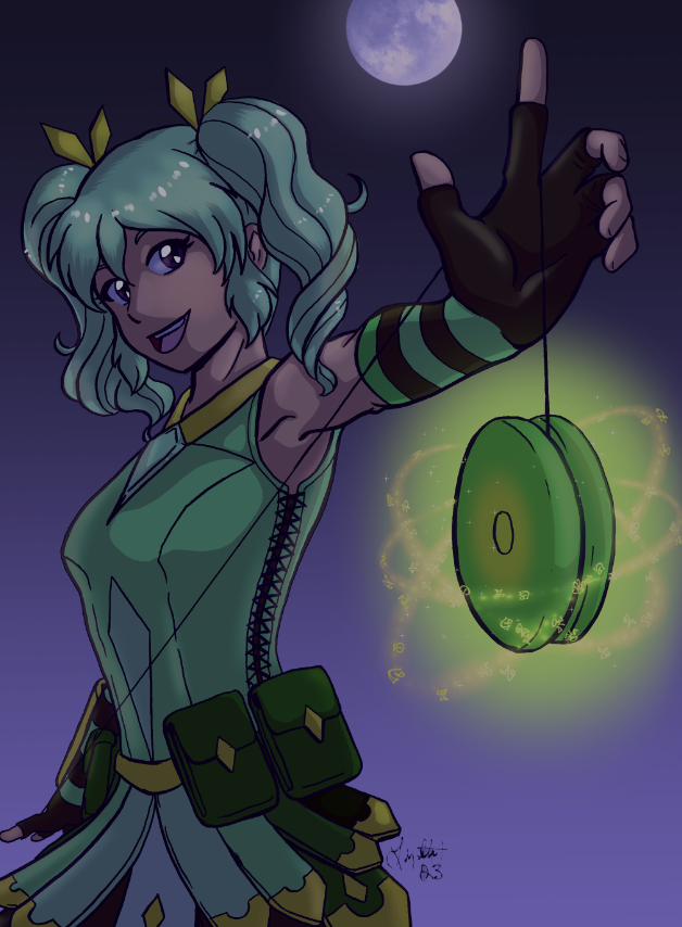
Using a large soft airbrush, add some color variation to the blue layer by putting some darker shades in the shadow areas and lighter shades in the highlight areas.
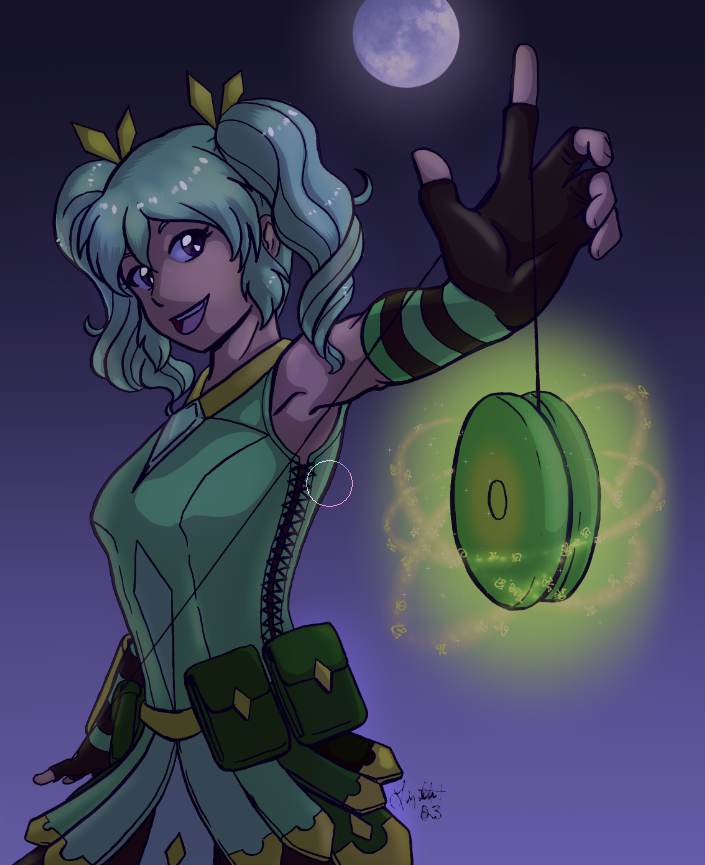
If you want to add some glittery specks, use a Bokeh brush on a new layer set to Add. Keep the bokeh effect soft and close to the light source of the image. I kept the bokeh behind my character but if you want more of the glitter effect feel free to put some over the character as well!
I used the following free brush for the bokeh effect. https://assets.clip-studio.com/en-us/detail?id=2123645
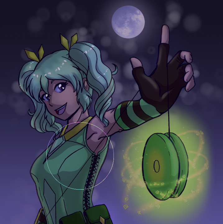
Create another layer and set it to the Add blending mode as well. Then, using a light yellow color and the Soft Airbrush, paint in the light areas on your character. I also used white and a small airbrush to add some brighter highlights to the eyes and on the shine of the hair to make them “pop”.
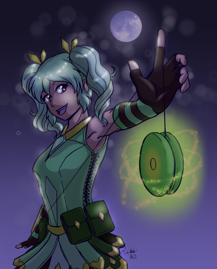
Below is the original version of this drawing on the left and the new version on the right. I think they both have their strengths but I also think using this technique makes creating a nighttime scene much easier, especially if you are still getting used to coloring different lighting scenarios!
Conclusion
I think some of these techniques are winners and others are ones that I would only use rarely, but that doesn’t mean they aren’t good techniques for those who want to use them! All of these were easy to do and produced good results, and now you and I both have new tricks to add to our arsenal to make better art!
For more information on CLIP Studio Paint, please visit https://www.clipstudio.net/en or https://graphixly.com