Soft Watercolor Look with AI Colorization
Contact Graphixly @
Hello! My name is Liz Staley and I’m a long-time user of Clip Studio Paint (I started using the program back when it was known as Manga Studio 4!). I was a beta-tester on the Manga Studio 5 program and for Clip Studio Paint, and I have written three books and several video courses about the program. Many of you probably know my name from those books, in fact. I write weekly posts on Graphixly.com and on CSP Tips, so be sure to come back every week to learn more Clip Studio Tips and Tricks from me!
AI Colorization is, in my experience, very hit-or-miss. Sometimes it can do a great job at colorizing, and sometimes it is wildly off. However, it can be used to create a nice base for a soft, watercolor-like coloring job for illustrations.
In this article we will cover the following topics:
Base Coloring with AI Colorization
Finishing Touches
Let’s get to coloring!
Base Coloring with AI Colorization
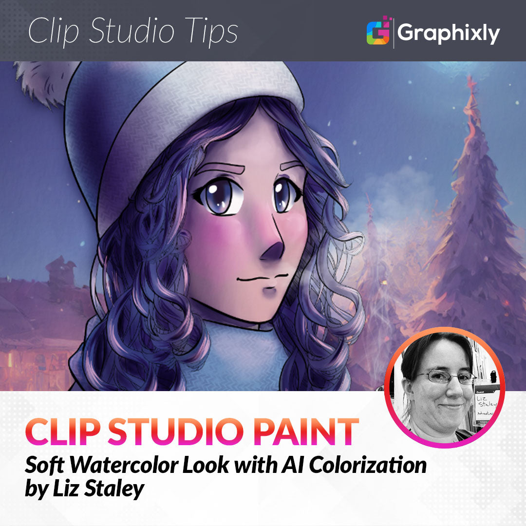
To start, we of course need a drawing that we want to color. I’ll be using this drawing I did last week for my previous article. Your lines need to be on one layer, and you will need to click on the “Set as Reference Layer” icon (the one that looks like a lighthouse) for this layer before continuing.

Next, on a new layer, we can paint in some rough suggested colors. This is going to tell Clip Studio Paint what colors we want to use and where we want them. I added a little hit of shading and highlighting in a few places to get some color variation. Also, I didn’t bother putting the white in the eyes because we’ll be painting the eyes in the next section.

Note that accuracy isn’t needed here, we just want to give CSP hints of where to put the colors.
While on the layer with these color hints, click on Edit - Colorize - Use hint image and colorize.

Colorize usually looks a bit like a mess at this stage but that’s alright. We’re just using this as a nice soft base for our finished colors. If you have a lot of color spill, take a soft eraser and clean up the edges a little bit.

For this image I actually already had a background image chosen, so I wanted to make sure I kept the background in mind while working. The AI Colorize layer automatically sets itself to Multiply, so I added a layer called “white adjust” behind the colorize layer. To create this adjustment, I simply used the Auto Select tool (the magic wand) and went to the lineart layer. Then I clicked in the area outside of the drawing to make a selection. Using the quick selection bar beneath the selection, click the “Invert selection” icon. Then create a new raster layer underneath the color layer and the lineart layer and fill the selection with white.

Below is what my image looks like with the background on but without this white fill layer to block the background from showing through the character’s colors.

Now that we have our colorized base done, we can move on to the finishing touches!
Finishing Touches
First, let’s take care of the eyes. Create a new Raster Layer and set it to between 80-90% opacity. Then paint the white of the character’s eyes in. I ended up also putting in the iris color as well because I didn’t care for how the AI Colorize filled in the eyes.
With the flat colors for the eyes filled in, create another new Raster Layer above the eye layer. Right-click on this new layer and select “Layer Settings - Clip to Layer Below”. This will keep our shading from “spilling out” of the eye area.

Using a soft airbrush set to Multiply mode and several shades of dark blue and purple, I painted in some shading and the pupil. Don’t forget to shade the whites of the eyes as well, as the top eyelid casts a shadow on the eyeball in real life!

Next, create a new raster layer above the eye layers. Using white (or another light color of your choice), add some shine to the eyes. You can also paint in some light areas on this layer with a soft airbrush if you’d like!

Next, let’s start adding some shading and definition to the image. To do this, create a new Raster Layer above the coloring layer. Then, using a soft airbrush set to Multiply and a shading color of your choice (I used a dark purple), start defining the shadows.

Use the Blend tool to smooth out the transition areas between the base color and the shadows. If there are any areas where the color from one area is spilling over to another and you want a more definite separation, you can use the Fingertip tool to “push” the color around. I did that on this piece of hair that has some of the skin color coming on to it.

Add darker shadows and blend to get smooth transitions.

After getting the shadow areas planned out, using the same brush and a slightly darker color, go in and make the deeper areas even darker to add more contrast. I did this on the parts of the hair that are behind other parts, under the brim and on the left side of the hat, under the nose, the neck, and on some areas of the coat and hands.
You can also use a Pen tool to add some dark strands along the hair to make it look more detailed and more like hair instead of blobs.

To create highlights, make a new layer and set it to the Screen blending mode. Then, using a light color (I used a light pink taken from the background image I’m using), I just took a pen tool and blocked in the highlight areas.

Then use the Blend tool to blend the highlight color out. I almost completely blended the highlights out in lots of areas, but left some hard edges in the hair to make it look like certain strands are catching the light.

You can add another layer of lighter highlights if your lighting is harsh or you want to make some areas “pop” a bit more. I decided I liked the look of my image just as it was, but wanted to add a few finishing effects.
I added a subtle knit texture to the hat and scarf on a layer set to Multiply at 25% Opacity. I also used a smoke/steam brush to add a little puff of breath from the character and some steam from the coffee cup on a Normal layer at 100% opacity.

To finish up, I also added a subtle watercolor paper texture. I set the paper texture layer to Overlay at 20% opacity. The effect is very subtle but it adds just a little something to it, I think!

Conclusion
There are so many ways of using the features of Clip Studio Paint, and it’s a lot of fun to experiment and see what you can come up with! I love trying out new styles to see how they look and what I can create with the tools provided by the software.
For more information on CLIP Studio Paint, please visit https://www.clipstudio.net/en or https://graphixly.com