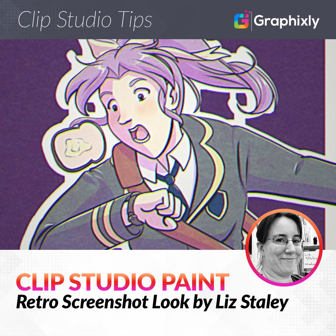
Retro Screenshot Look
Contact Graphixly @
Hello! My name is Liz Staley and I’m a long-time user of Clip Studio Paint (I started using the program back when it was known as Manga Studio 4!). I was a beta-tester on the Manga Studio 5 program and for Clip Studio Paint, and I have written three books and several video courses about the program. Many of you probably know my name from those books, in fact. I write weekly posts on Graphixly.com and on CSP Tips, so be sure to come back every week to learn more Clip Studio Tips and Tricks from me!
I started watching anime back in the 90’s and there is just something nostalgic and comforting about the look of VHS screenshots from those early anime. Even images in the few anime magazines from the time (does anyone else remember Animerica or was that a fever dream?) were low resolution and had the same sort of color shift look to them, so you could probably use this method to imitate an old magazine.
This process has a lot of steps but is fairly easy once you get the hang of it.
In this article we will cover the following topics:
Adding Blur and Noise
Making the Color Shift Effect
Let’s get started!
Adding Blur and Noise
Ideally, you will use an image with cel shading. You can also study the styles of the 80’s and 90’s anime if you really want to make this look like it’s from that time. For this article I used my most recent piece of art, which is soft shaded so it ended up looking more like an image from an old magazine. However I did do this process again on another image that is cel shaded, and below are the results!

To start, if your image is composed of lots of layers you’ll want to create a new flat layer to work from. Do this by clicking on your top layer, then click on Layer - Merge visible to new layer. (You can also do this by right-clicking on the top layer in the Layer palette)

Now you should have one layer that has your flat image on it. I put my original layers in a folder that I then “closed” to save space in my Layer palette.

The first thing we need to do is adjust the Brightness and Contrast, because old video formats never have pure black or pure white in the images. I remember being told in college in our video courses that this was because using a pure black or pure white would actually make the speakers on TVs buzz, but I don’t know if that’s accurate or not.
Click on Edit - Tonal Correction - Brightness/Contrast.

The amount that you use may vary depending on your image. I ended up bringing my Brightness to 15 and the Contrast to -10. You just want to make your light colors a little darker and your dark colors a little lighter so that there’s no pure white or black.

Next make TWO copies of your illustration layer.

With the top layer of the stack selected, go to Filter - Blur - Gaussian Blur.

Old anime VHS were low resolution, so we need to add some blur and such to our image so that it doesn’t look like it’s 4K. The amount you use will depend on your illustration, I used a value of 15.

Now set this blurred layer to the Color blending mode.

Click on the second copy of your illustration layer (which should be the middle layer in the layer stack) and run the Gaussian Blur filter again, though with less blur this time. Set this layer to 30% opacity.
Now we’re going to drop the resolution of our image. Go to Edit - Change Image Resolution.

The exact setting you want to use will, again, depend on your image. I decided to set my Scale to 0.5 so that my image would reduce my 50%.

Now we already have some blurring, some color fringing (where the color bleeds slightly to another area) and some pixelation.

Right-click on the top layer and select Merge visible to new layer. This will give us a new top layer that is a merged copy of our progress so far.

Now, with the new copy layer selected, go to Filter - Sharpen - Unsharp Mask.

I used a Radius of 10, a Strength of 80, and a Threshold of 0 for the Unsharp Mask. Use the settings that will give you a look that you like. If you’re unsure, uncheck the Preview box to see what the image looks like with the filter applied, then check it again to compare with the current settings.

Remember earlier when I talked about how there was never pure black or pure white in graphics on old TVs? Now we’re going to take the dark areas and light areas of our image and make them slightly colored. If you take a random old screenshot from an anime and color-pick the shadows and highlights, you’ll find all sorts of colors from orangey-black to very dark green. If you’re going for the aesthetic of a certain show, like Sailor Moon or Record of Lodoss War, find a screenshot and use the eyedrop tool in the darkest and lightest areas to see what color they tend to lean toward so you can match that color.
Click on Layer - New Correction Layer - Gradient Map.

I’m not going to go into too much about gradient maps right now (We discussed them in detail in one of my other articles!), but they basically allow us to change colors according to a gradient. The default gradient map is black on the left side and white on the right side. This turns our image into a grayscale version.

Click on the ^ symbol on the right side of the gradient bar and click on the black square under the “Specified color” option to bring up the Color Picker. Select the color for your “black” areas. I chose a very dark blue at first, then changed it to a very dark purple.

Next click on the ^ symbol under the right side of the gradient bar. Then under the Specified Color option, click on the white rectangle and select the color for your light areas. I chose a very light pink.

Set the opacity of your Gradient Map layer to something around 15%.

Now it’s time to add some noise! This is the little pixel bits that are seen in old anime images. Create a new raster layer at the top of the layer stack. Then click on Filter - Render - Perlin Noise.

Set the options for your noise. This will partially depend on the overall size of your image and how large you want your noise particles to be.

Once you’ve set your Perlin Noise filter, then run the Gaussian Blur filter to blur the noise slightly.

Set the noise layer to Soft Light and around 50% Opacity.
Noise from old TVs is actually colored, but Clip Studio Paint’s perlin noise filter only creates monochromatic noise. To remedy this, I found a free material from CSP User Nyght called “Colorful Noise Texture”. You can find this material at the following link: https://assets.clip-studio.com/en-us/detail?id=1890517
I downloaded this material and added it to my image (It’s free!) then set the Blending Mode to Overlay and dropped the Opacity. Now the grain on my image has a bit of color, making it look more convincing.

Right-click on the top layer and select Merge visible to new layer.

We’re most of the way there now! In the next section we’ll finish up with some other details.
Making the Color Shift Effect
After doing the merge visible command from the end of the previous section, create three more copies of the illustration so far. You should have 4 layers, all with the same flat version of the illustration on it. Name these layers as Red, Green, Blue, and Black.

Select either the Red, Green, or Blue layer. I’m doing the Red layer first. We are going to use these layers to separate out each of the RGB colors that make up our image so that we can get a color feathering effect that is usually present on low-resolution images from VHS tapes and early DVD.
Go to Edit - Tonal Correction - Level Correction.

Using the drop down menu at the top of the Level Correction window, select one of the colors that is NOT the name of your current level. I am starting with the Red layer, so I’m selecting Green from the dropdown menu first.

Next, under the Output option (at the bottom of the Level correction window), click on the arrow on the right side of the gradient and drag it all the way to the left.

Now select the other color from the drop down menu and do the same with the Output. Since I am on the Red layer, and I already did the Green output, I switched to the Blue option. Doing this cancels out the green and blue colors on this layer, leaving us with only the Red.

Click on OK. Then repeat those steps with the remaining two color layers. In the end you should have one layer that is all red tones, one that is all greens, and one that is all blues. Select the Black layer and fill it with a flat black color.

Now, set the Red, Green, and Blue layers all to the Screen blending mode. Your image, with its original colors, will return! If it doesn’t look right, make sure that the Black layer is on Normal blending mode and is at 100% opacity and that the other three color layers are all set to Screen.

Select one of the color layers and then select the Move tool. Use the arrow keys on the keyboard to shift the layer a few pixels in either direction. Repeat this with the other color layers, shifting them around in different directions until you like the look. In the screenshot below, you can see that there’s some green in the line of the cheek and the mouth. This is the feathering effect that we’re looking for.

I then created a new folder and placed the layers inside of it.

Because I am paranoid, I then copied the folder and layers so I had a backup in case anything happened. Then I turned the visibility off on the copy layer before proceeding.

Right-click on the visible layer and select Merge Visible to New Layer. Now let’s apply one more Gaussian Blur to this new merged layer.

Change the blurred layer’s blending mode to Color.

And we’re done! You can now save your image as a JPG file. If you want to add some extra artifacting, be sure to drop the quality of the JPG to 80 or lower.
My original illustration is on the left and the edited version is on the right in the following screenshot.

Conclusion
With the proper application of tools, almost any look is possible!
For more information on CLIP Studio Paint, please visit https://www.clipstudio.net/en or https://graphixly.com