Prepping art for Print
Contact Graphixly @
Hello! My name is Liz Staley and I’m a long-time user of Clip Studio Paint (I started using the program back when it was known as Manga Studio 4!). I was a beta-tester on the Manga Studio 5 program and for Clip Studio Paint, and I have written three books and several video courses about the program. Many of you probably know my name from those books, in fact. I write weekly posts on Graphixly.com and on CSP Tips, so be sure to come back every week to learn more Clip Studio Tips and Tricks from me!
Getting your art to translate from screen to paper can be a tricky thing. You need to plan ahead a bit and know some basics, but once you have this knowledge you should be able to turn your work into physical prints without too much heartache.
In this article we will cover the following topics:
Planning for Print
Your Canvas settings
Color Profiles
Exporting your Image
Let’s get in to it!
Planning for Print
Color mismatch is a common problem when going from the digital realm to the physical realm. There have been pages and pages of information written about this, so I will give the very basics here. Why do colors print differently than they look on screen?
When we work on an image digitally, the colors are being generated by light. Your computer monitor takes red, green, and blue lights and combines them in certain ways to create different colors. In RGB color modes, it is the combination of these three colors together that create white.
When printing, we are using inks that are usually Cyan, Magenta, Yellow, and Black (some specialty printers have white or other specialty inks, but when talking about home printers and even most print services, we usually deal with CMYK color). Tiny dots of these inks are combined to create the illusion of different colors when an image is printed. If you print an image from your printer at home and look very closely at the paper, you may even be able to see these tiny dots! When Cyan, Magenta, and Yellow inks are layered on top of one another, the color becomes darker until it is black (or almost black).

Since CMYK is ink and not light, printed colors tend to be darker than their on-screen counterparts. There are also some colors that are nearly impossible to reproduce with a home printing system or without finding a printing service that deals in specialty inks - this includes white ink (usually white in printing comes from the color of the paper), neon colors, metallics, and other special effect inks.
So, to put it very basically, colors look different when printed because the process of making those colors is different. One is light, the other is ink, so they create all the shades of the rainbow in different ways. Printed images will look duller than their digital counterparts, so keep this in mind when creating your work!
Your Canvas Settings
When creating an image, you will want to keep in mind that at some point you might want to print it out. It is a good habit to get into to always create your work in a resolution that will look crisp when printed. 300dpi is a good starting point for resolution when going to print. Images that are lower in resolution than this tend to look blurry or pixelated when printed. If your computer hardware has the processing power and hard drive space, you can even go higher than 300dpi if you’d like! I’ve found that for black and white art starting at about 600dpi will produce much better-looking results than 300.
In the screenshot below, you can clearly see how much smoother and nicer the art in the left image looks when compared to the lower resolution image on the right.

When creating a new piece, you will also want to think about the size that you will eventually print it at. Standard paper sizes are the easiest to run through a home printer, though most home printers don’t go to a very large paper size unless you specifically buy one that is made for large format printing.
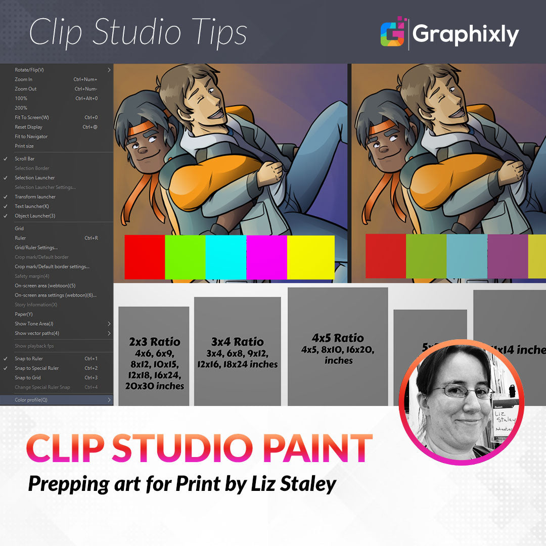
If you aren’t sure what size you’ll want your finished print to be, then you’ll need to think about the ratio that you’re going to set your canvas to when you begin drawing. A ratio is simply the relationship of the measurement of one side to another side. This can greatly change the cropping of your composition if you don’t think about it initially.The image below shows some common ratios and their corresponding image sizes.

Remember that it is better to make your image smaller than to try and make it larger. If you work in a 3x4 ratio and start your canvas out at 18x24 inches then you have the option of printing at any size smaller than that without losing any quality. Of course 18x24 is quite a large canvas and will take a lot of computing power, so consider that as well.
You can, of course, also create canvases that are your own sizes. Square compositions can be quite eye-catching, or maybe you want to create an image that is 5x20 inches. Don’t be afraid to experiment with your canvas sizes and proportions, but also remember that specialty sized papers can be difficult - and expensive! - to print and are sometimes a hard sell. Someone who buys art to frame it and hang it on their wall may turn away from an oddly sized print because of the high cost of getting a custom frame made. This shouldn’t discourage you from making prints in sizes that aren’t standard, but you should keep this in mind!
Okay, so we’ve created a canvas that is at least 300dpi and made sure to work as large as we can so we can scale down to smaller print sizes if we want. After we create our art, what’s next? Read on to find out!
Color Profiles
Users of CSP that come from programs like Photoshop are often confused about the color profiles. Photoshop and other image programs like it allow you to set your file to CMYK off the bat and work in that color space instead of RGB so you get a better idea of how your image will look when printed.
Clip Studio Paint only allows you to work in RGB color space, but it includes Color Profiles that will allow you to see your image in other color spaces. But first we need to set which color profile we want to use for our profile, which we can do by going to View - Color Profile - Preview Settings as shown in the following image.

In the Preview Of Color Profile settings window, click on the Profile for Preview dropdown to see the list of available profiles, which are shown in the screenshot below as well.

This list is pretty intimidating! Lots of the profiles are specific to regions, and there are also profiles for printing on coated (glossy) or uncoated (matte) paper stock. If you are printing through a professional printer, ask them which color profile you should use. They will likely be able to tell you which profile they prefer for the best color match.
For this example, I’m going to select the “CMYK : Japan Color 2001 Coated” profile just for demonstration purposes. You will want to select the profile for your region and paper type (or the profile your print provider tells you to use).
With the profile selected in the dropdown, click on OK to return to your canvas. Your image will now be previewing in the color profile you selected. To turn the preview off, go to View - Color Profile and deselect the Preview option. You can toggle the preview off and on by using this menu option.
Below is a side-by-side comparison of the same image. The left is RGB and the right is our CMYK preview. Note how the colors have desaturated, especially on the very bright squares of color!

To adjust your colors, you can go back to the Profile Preview Settings and check the box next to “Tonal Correction”, then use the activated dropdown menus and the graph at the bottom of the window to adjust the colors to your liking.
Now that we have an idea of what our image will look like printed, let’s export from CSP to a file format that we can send to our printer of choice or print from at home.
Exporting Your Image
Remember to save your image as a .clip file before exporting for print! This way you can always go back to your original if you need to make changes. Back ups are important when working with digital art.
Since we’re going to export as CMYK, let’s use a .TIFF file. If you are using a printing service, be sure to ask if they have a file format preference before exporting your images. Some like PDF files, while others will only accept JPG. Make sure you know which format they want!
Click on File - Export (Single Layer) - .tif (TIFF). The next window will ask you to enter a name for your file and to select where to save the file on your computer.
Once you’ve entered a name and chosen your save location, the TIFF export settings will come up. This window is shown in the image below.

Under “Expression Color” select CMYK color from the dropdown. You can also choose to resize your image in this window as well. Check the “Preview rendering result on output” box at the top to see a preview of your exported image before the final export is completed.
Click on OK to save your exported image. Now you can open the image and print it on your printer at home or send to a local print shop or online printing service. I recommend printing a test print at home if you have a printer just to get an idea of how the prints will look if you are using an outside printing service. This isn’t a sure-fire way to know whether your colors will match because each printer is different, but you can get a basic idea of whether you need to go back and make adjustments to the levels, saturation, or color balance this way.
Conclusion
Printing your work is a great way to show it in a portfolio or make money selling prints. With a little bit of knowledge and these tips, you’ll be able to get your prints looking great without wasting a lot of time making print after print to test colors. Happy printing!
For more information on CLIP Studio Paint, please visit https://www.clipstudio.net/en or https://graphixly.com