Oil Paint
Contact Graphixly @
Hello! My name is Liz Staley and I’m a long-time user of Clip Studio Paint (I started using the program back when it was known as Manga Studio 4!). I was a beta-tester on the Manga Studio 5 program and for Clip Studio Paint, and I have written three books and several video courses about the program. Many of you probably know my name from those books, in fact!
Clip Studio Paint comes with a robust number of tools that mimic traditional mediums, including pencils, watercolor, india ink, and paints. These tools can help you create a variety of looks that are almost imperceptible from using traditional mediums.
In this article we will cover the following topics:
Setting up a canvas
Sketching your painting
Making a color palette
Painting
Finishing Touches and Textures
Let’s get started painting!
Setting Up A Canvas
The first step is to create a canvas to make our painting on, of course! You can create your canvas at any size you want. I used the settings in the following screenshot to create my canvas. I chose to make my painting 10 inches wide by 8 inches tall, 350dpi, and to change the paper color to an ivory tone so that I wasn’t painting directly on white. This can help make your colors more accurate while you’re painting.
Click on OK to create your new canvas so we can begin making our art!
Sketching Your Painting
You can paint whatever you can imagine, of course, but for this article I’ve decided to create a path through a small forest of trees and to put a silhouette of a deer standing on the path.
You can see my very rough sketch in the screenshot below.

I sketched in a dark brown color instead of black, and used my favorite pencil tool to make the lines. This sketch doesn’t need to be perfect, we’ll just be using it for reference as we do the painting, and for the next step where we use the colorize feature to help create a color palette for our painting.
(You may also notice that I put a canvas texture over my background Paper color before I started sketching. Later on, I actually moved this texture to the top of the layer stack and used it to do some color adjusting. More on that later!)
Making a Color Palette
Now that the sketch is done, it’s time to think about color. In this tutorial, we’re going to put some basic colors down and then use the Colorize feature to blend the colors and create mid-tones that we’ll use to blend colors and add details later.
Create a new raster layer below the sketch layer and begin putting some very rough colors in areas of your sketch. I found a color palette that I liked from a blog and used it as a basis for my starting colors. When using the Colorize feature, it is best to go a bit brighter than the finished painting you want to be because Colorize will mute the colors a bit when it blends them.
In the screenshot below, you can see the very rough colors I started with for this painting. I added the colors using the Oil Paint brush and just tried to get them vaguely in my sketch lines. Perfection is not needed for this step!

Once we have some blobs of color laid down, we need to tell Clip Studio Paint what to do with those colors. Select your sketch layer and set it as a Reference Layer using the “Set as Reference Layer” icon in the Layer palette. This icon is indicated in the screenshot below.

Once the sketch layer is set as a reference, select the layer that contains your rough color palette. When we run the Colorize feature, Clip Studio Paint will use the sketch layer as a reference and use the currently active layer as a suggestion for our colors.
To use Colorize, click on Edit - Colorize (Technology Preview) - Use Hint Image And Colorize. You will need to be connected to the internet to use this feature, as CSP sends the image to a server and AI will process the colors and lines to return a fully colored image.
The screenshot below shows the results of Colorize on my sketch and color palette. Notice how much more muted the colors are than the original colors I put down!

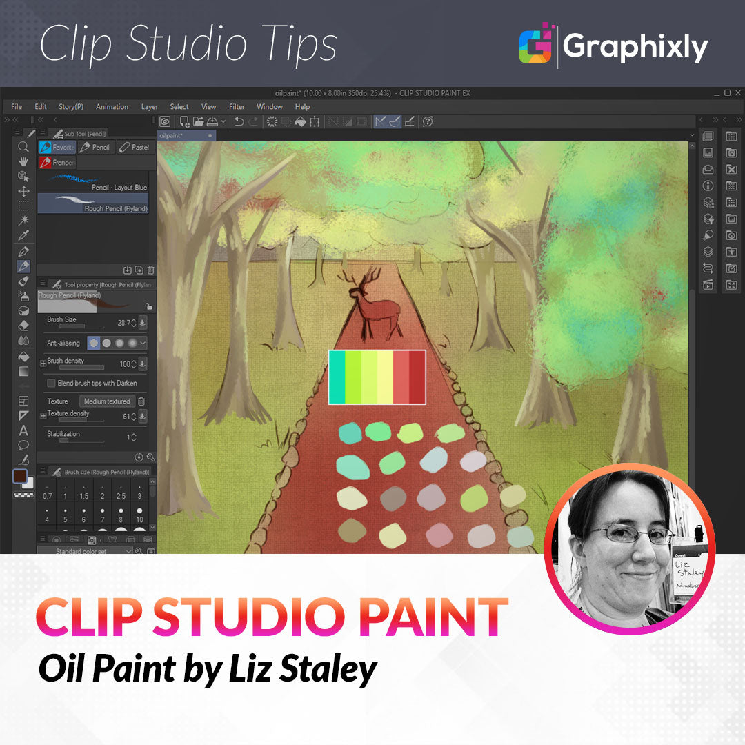
Now, create a new Raster layer above the other layers. Using the eyedropper tool and the oil paint brush or a marker tool, sample colors from around the image that you will use on the final painting. The color palette I created is shown in the following image.

We will be using the eyedropper to sample colors from this palette to complete our painting in the next section.
Painting
With the prep work done, now it’s time to get to painting! I’ve decided to start with the tree trunks, but looking back on the piece I think I would do the grass or the sky first if I was doing this piece over again.
Using the Oil Paint and Oil Paint Flat sub-tools under the Brush category, I began sampling colors from the palette created in the previous section and using downward strokes to fill in the tree trunks and add shading and highlighting. Going over the brush strokes with less pressure will help blend the strokes together. Remember that objects in the background will become less detailed and also less saturated as they recede away from the viewer.
I painted in the rough shapes and rough highlights and shading on each tree trunk, using one layer for all the trunks. As you can see in the screenshot below, I moved my palette layer around so it wasn’t in the way of the area I was painting in.

Now that the tree trunks are painted in, I’m going to start blocking in the leaves on the trees. To do this, I started with a new Raster layer over top of the layer I painted the trunks on. Then I began blocking in the rough shapes of the groups of leaves using the Pointillism sub-tool. I found this brush to be great for getting the impression of leaves without having to go in and paint individual leaves on each tree, so if you have trees in the distance in your painting you may want to give this tool a try for quickly getting the feeling of leaves! The screenshot below shows the beginnings of my leaf progress.

Again, I’m continuing to select colors from my palette layer and using them to build up the light and shadow on the leaves.
To get more depth, I made layers behind the tree trunks and continued adding layers of leaves using different colors and the Pointillism brush to add volume and depth to the trees.
To paint the sky, I made a raster layer and put it at the bottom of the layer stack, then added random areas of colors with the oil paint tool. Then I used the Blend tool to blend them out into a gradient. I didn’t spend too much time on the sky because it’s mostly covered by leaves, but I knew that I wanted it to be lighter in the area where it meets the path under the trees so that the deer silhouette would stand out.
I used the same process for the grass, though I just used the Blend tool on the areas in the distance and used the Oil Paint brush to blend the areas in the foreground so that it would look more like the brush strokes you get when working with real paint.
Using smaller brushes, I added some texture to the closest tree trunks. Then I selected a dark color and painted in my deer silhouette.
Now it’s time for a few finishing touches!
Finishing Touches and Textures
While looking at my nearly-finished painting, I realized that the colors were a bit blander than I wanted. Plus I wanted a texture to my painting that would make it look more like it was painted on a canvas. The CSP Material Library comes with a canvas texture, which I applied to the top of my painting. I resized the texture so that it was almost the height of my canvas. Then I set the canvas texture layer to the Overlay blending mode (which brightened up the colors some) and set the Opacity to 50% so the texture wouldn’t overpower the art. You can see the result of this in the following screenshot.

After looking at the painting a little longer, I thought the deer silhouette was too dark and didn’t look like part of the painting. To fix this, I selected the layer with my deer on it and used the Hue/Saturation/Luminosity controls to make it a bit lighter. I also added a little bit of a gradient on the top of the deer so that it looked like the light from the trees was hitting the antlers.

Now we can sign our work and save it for printing or display on the web! (Or, in my case, inclusion in this article!)
Conclusion
Digital painting isn’t necessarily easier than traditional painting, but it does have some advantages over getting out a physical canvas, paints, and brushes. For one, it’s much cleaner than traditional paints! The inclusion of layers also makes it easier to add details and work on one area without disturbing another. Using the right tools, you can create the look of any medium you want using digital means! I hope this article has inspired you to try something new with your digital art!