New 2.3.0 Text Features
Contact Graphixly @
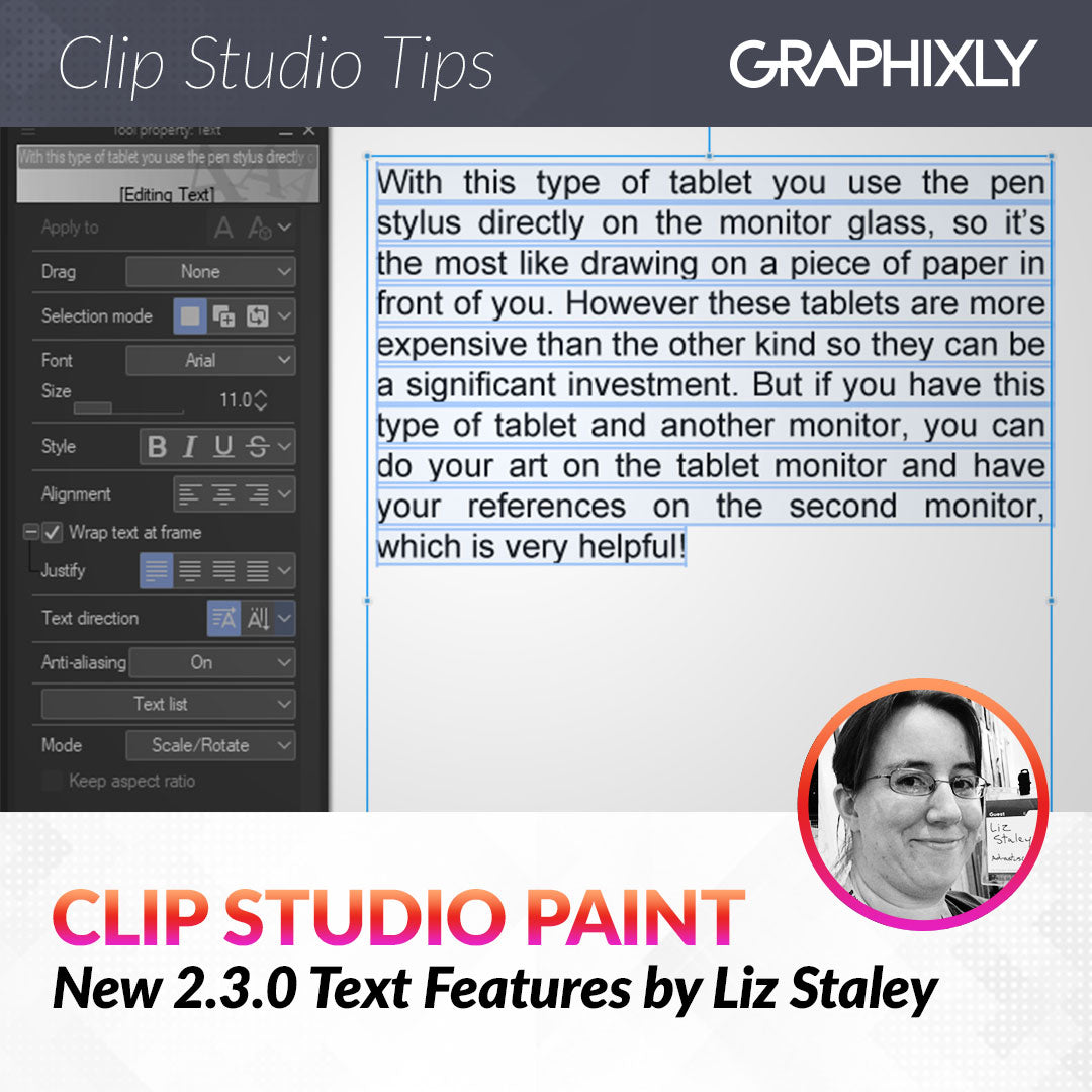
Hello! My name is Liz Staley and I’m a long-time user of Clip Studio Paint (I started using the program back when it was known as Manga Studio 4!). I was a beta-tester on the Manga Studio 5 program and for Clip Studio Paint, and I have written three books and several video courses about the program. Many of you probably know my name from those books, in fact. I write weekly posts on Graphixly.com and on CSP Tips, so be sure to come back every week to learn more Clip Studio Tips and Tricks from me!
I have been wanting more text editing options in CSP for ages and they are FINALLY here! In the Version 2.3.0 update released on December 5, 2023 (available with monthly subscriptions or with the Update Pass), text justification and Kerning/Spacing were finally added as options for text. Let’s take a look at these new options!
In this article we will cover the following topics:
Accessing New Options
Text Justification
Kerning and Text Ratios
Let’s look at some new features.
Accessing New Options
First, you must have either the Update Pass (for perpetual license holders) or the monthly subscription in order to update to any versions above 2.0. I am using CSP on my desktop PC so I have the Update Pass.
Make sure that you’ve installed the proper update, then start up Clip Studio Paint. Create a new canvas and choose the Text tool. You may see the new options in the Text Tool Property window already, but if they aren’t there and you want fast access to them, you can add them to the main tool property window easily!
Click on the Wrench icon in the bottom right corner of the Tool Property window to open the Sub Tool Detail window.
Under the “Font” category in Sub Tool Detail, you will find these new features: Horizontal ratio, Vertical ratio, Kerning, Character Spacing, and Condense text. To add any of these features to the main Tool Property window of the text tool, click on the empty box to the left of the option to turn it blue and make a little eye icon appear. This will add the option to the tool property window.
In the screenshot below the “Kerning” box is gray and lacking the icon, but I want to add it to my tool property window for quick access, so click on it.

And now you can see “Kerning” beneath the font size in my Tool Property window!

After adding the “Justify” option from the Line space/alignment section of the Sub Tool Detail, now I have the new text options in my Tool Property window and ready to use easily!

Text Justification
Let’s talk about Text Justification first. To demonstrate the Justify features, I copied and pasted a few sentences of text into a text box and set it to “Wrap text at frame”. You can see in the image below that with no Justify option selected that the end of each line of text is uneven.

Now let’s click on the “Align last line left” justify option. This makes all the lines of text space out so that they end at the end of the text box, but the spacing on the very last (partial) line has not changed at all.

The next option is Align Last Line Center, shown below. Now all our full lines of text are spaced so that they all end at the right side of the text box, and the final line is centered in the text box.

The Align Last Line Right option lines up the last line of text with the right side of the text box.

The final option is just called “Justify” and it will space out our final partial line of text so that it fills the entire text box. This usually looks best with more words in the last line so that there isn’t so much empty space between them! In the case of this text box if I wanted to use this option I would probably make the text frame smaller to force more words to the last line and balance it out a bit!

Now let’s move on to the Kerning and spacing options.
Kerning and Spacing Options
Kerning is the typography term for the spacing between individual letters or characters in a block of text. Most fonts look fine with default kerning, but if you’ve ever encountered a font that had some letters with too much or too little space between them, then you’ve seen instances where adjusting the kerning can make a better design!
For instance, the font below is designed to have the letters connected together, but there are some letters that have a little space between them, which breaks up the look and makes it seem just a bit awkward. There is also a large space between the second word’s “i” and “n” which just seems a bit strange. This is where adjusting the kerning and spacing comes in!

Kerning in CSP will allow us to adjust the spacing between two letters at a time. I have decided to start with the little gap between the “e” and “n” in the middle of “Adventure”. Click to put the mouse between the two letters you want to adjust. Then use the slider under the “Kerning” dropdown to change the space. Making the number larger will increase the space between the two letters, as seen below.

Conversely, making the slider number smaller will bring the two letters closer together. You can see in the image below that now they’re too close!

In addition to the Kerning option, there is now also a “Character spacing” option. As far as I can tell, this character spacing slider can be used to adjust multiple characters at once. For instance, I want to bring all the small letters in “Space” closer together. Let’s select several letters and see what happens when we move the slider to the right to increase the value.

Moving the slider to the left to make the value smaller will bring the characters closer together, of course!

Now that we have the kerning and spacing looking good, we can make final adjustments. I wanted to try out the new horizontal and vertical ratio adjustments. First let’s select all our text and then turn the horizontal ratio down. This brings the letters tighter in together horizontally while keeping the vertical ratio the same.

Increasing the horizontal ratio stretches the characters horizontally without changing their vertical size, as shown below.

Next let’s try the vertical ratio! Making this value smaller squishes the text vertically without changing the horizontal space that each letter occupies. Notice that the space between the text lines also becomes larger.

Of course increasing the vertical ratio does the opposite- making the letters vertically larger without changing the horizontal spacing. Again, note the change in empty space between the lines of text.

Conclusion
These long-awaited text options are simple to use but can make a huge difference in how your text looks. I, for one, am very glad that I won’t have to open other programs when I need to change text spacing any more!
For more information on CLIP Studio Paint, please visit https://www.clipstudio.net/en or https://graphixly.com