Making a Simple Background
Contact Graphixly @
Hello! My name is Liz Staley and I’m a long-time user of Clip Studio Paint (I started using the program back when it was known as Manga Studio 4!). I was a beta-tester on the Manga Studio 5 program and for Clip Studio Paint, and I have written three books and several video courses about the program. Many of you probably know my name from those books, in fact. I write weekly posts on Graphixly.com and on CSP Tips, so be sure to come back every week to learn more Clip Studio Tips and Tricks from me!
Sometimes I create an image and I really want to add a background but I don’t want it to be too complicated. I still want the character to be the central focus but it would be nice for them to be in a little bit of an environment. So this week let’s explore a process for doing just that! You can use the first part of this process to create one look, or use both parts to make something a little more complex that still allows your character to be the focus.
In this article we will cover the following topics:
Creating the Basic Background
Adding Simple Structures
Let’s get started!
Creating the Basic Background
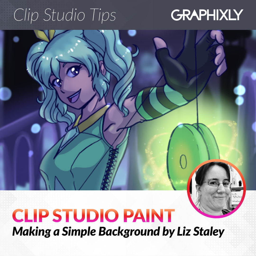
I had a vague idea of what I wanted my background to look like thanks to looking at some inspiration online. I found one with a color palette I thought would look nice with my character and saved it to pick colors from. Then I set my character art where I wanted it and added a few base elements to get started, such as the moon (the light source for the image) and then a very basic gradient on a layer behind everything so I wasn’t starting with blank space.

Create a new raster layer and then select a brush that you like that has some texture to it. I decided to use the default Oil brush that comes with Clip Studio Paint. Then grab some colors and start “dabbing” them on the new layer. I chose colors from the reference image I was using and made some random shapes with them. Are they clouds? Are they trees? Doesn’t matter!!
Add some more colors until you’re happy with it. This is a great way to make some out of focus foliage, by the way! Just use various shades of greens and yellows to simulate clumps of leaves. 
Now that we have our blocks of color down, go to Filter - Blur - Gaussian Blur and add some blur to the layer you were just working on. The amount will depend on the size of your canvas and the look you want to achieve. I ended up using a strength of 65 on my image. Make sure to check the “Preview” box so that you can see the end result before finalizing the filter.
Click OK to apply the Gaussian blur. Now your first layer will look like it’s in a nice soft focus.
Now let’s add some bokeh light! Bokeh is a really popular background effect where points of light are photographed out of focus, and I think they look absolutely magical. Create a new raster layer (this time I made it above my character so I could put some of the lights overlapping her outline). Set the blending mode to Add (Glow).
Then I took the “Color change” brush under the Thick Paint subtool category and set my foreground color to a light blue with the background color as purple. Then create some different sized circles with the brush by just using my stylus at different pressures. With the color change brush if you go over the same spot with a few presses you can get circles that have a blended color in the center as well. 
I didn’t like how hard the edges were on my bokeh spots so I applied a bit of Gaussian Blur to the layer to soften them up just a little. 
This would be a perfectly fine simple background just like this, but I wanted to add a bit of a fantasy cityscape in the background as well. We’ll do that in the next section!
Adding Simple Structures
To start adding some basic structures in the background, create a raster layer above the first layer we created in the section above. Then I used black and the “Oil paint flat brush” to quickly rough in the shape of some towers in the distance. Not going for perfection, I just want to have something in the background that hints at a city in the distance.
To add some color difference I added a gradient from purple to black at the bottom of the buildings on this layer.
Apply the Gaussian Blur to make the buildings look like they are part of the blurry background.
Add another new raster layer for the midground and repeat the process, this time with some lighter colors. I also added just a little bit of detail to this layer, like a few highlights on the edges of some of the structures to make it look as though the moon is lighting them up as well. Then apply a gaussian blur to this layer as well. 
I completed the process with another new Raster layer that I added another black simple shape to in order to make it look like there was a bit of a hill between the character and the buildings in the background. Again, apply the Gaussian Blur filter to this layer to make it fit with the rest of the background.
Now my image is complete! If you were going for a sunny scene you could put another Add (Glow) layer above the character and create a rim light to really make the character pop!
Conclusion
If you’re looking for a simple background that won’t draw too much attention away from your character, give this technique a try! Whether you make a fantastical scene or just use part of the technique to create some trees and motes of light, I think you’ll like the results.
For more information on CLIP Studio Paint, please visit https://www.clipstudio.net/en or https://graphixly.com