Lighting a Forest Background
Contact Graphixly @
Hello! My name is Liz Staley and I’m a long-time user of Clip Studio Paint (I started using the program back when it was known as Manga Studio 4!). I was a beta-tester on the Manga Studio 5 program and for Clip Studio Paint, and I have written three books and several video courses about the program. Many of you probably know my name from those books, in fact. I write weekly posts on Graphixly.com and on CSP Tips, so be sure to come back every week to learn more Clip Studio Tips and Tricks from me!
Having light interacting with your character can make them look more like they are part of the environment instead of just pasted on top of a background image. In this week’s post let’s create some light effects to create the look of light coming through trees on a character, as well as do some color correction to make them better blend in to the scene.
In this article we will cover the following topics:
Creating Light Dapples and Rays
Final Color Correcting
Let’s get coloring!
Creating Light Dapples and Rays
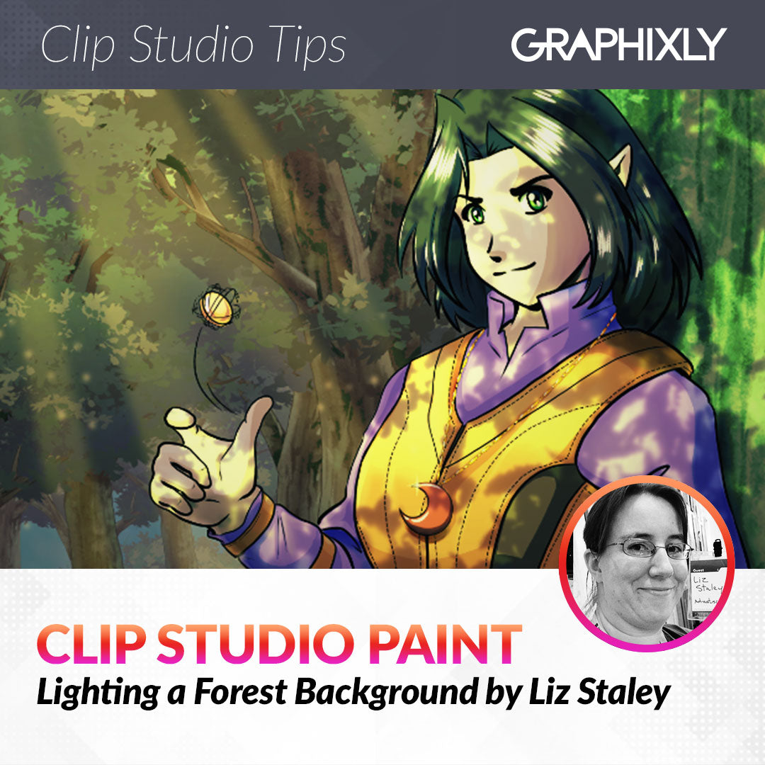
I drew and colored my character, then created a simple forest background with some tree brushes and a sky image material from the ASSETS library. This image looks fine now, but it could be so much better with some simple lighting effects to really make the character look like they’re in the environment instead of like they are standing in front of a flat background in a well-lit room.

First I did some organization by putting my background layers in a Layer folder. I created a combined copy layer of my character and the tree she’s leaning against to make the lighting effect I want to do easier, but saved all my original lineart and coloring layers in their own layer folder. To start with I want to create the light coming through the leaves of the forest on the character and the tree trunk behind her, so I created a new raster layer called “light through trees.”

You could create the light pattern by hand, but I used this awesome brush linked below instead:
https://assets.clip-studio.com/en-us/detail?id=1610988
However, the particles on this brush are quite small by default. My image is pretty large, so I opened the Sub Tool Detail window and then went to the Spraying Effect category. Click on the “Brush Size” checkbox to make the size of the brush change the size of the particles.

Next I selected a yellow-green color and used the Sunlight brush at random over my character. I made sure to get some of the patterns on the tree as well. I also tried to not get too many light spots on areas that would be away from the direction of my light, such as the bottom half of the breastplate.
Any easy way to “erase” any areas where the brush puts spots where you don’t want them is to switch to the “transparent” color and go over them with the same brush.

Once you’re happy with your light areas, right-click on the “light through trees” layer and select Layer Settings - Clip To Layer Below. On my image this makes it so the brush areas only show on my character and the tree, while the pixels outside of that are made invisible.

Set the layer to Color Dodge.

The effect was way too harsh for my liking, so I changed the opacity to 50%.

Because I made the particles of the brush so large, some of the edges are a bit pixelated. To fix this and to soften the overall effect, go to Filter - Blur - Gaussian Blur. I set the strength to 16.00 for my image.

Now I’m pretty happy with the way the dappled light looks on my character and the foreground tree!

Next I want to have some beams of light coming down behind the character and in front of the trees in the background. Create a new raster layer behind the character layer but above the background layers. Then use the polyline selection area tool to select some long, thin triangles going from the direction of the light source and down through the image. This looks best if you vary how thick and thin the beams are so they’re not all uniform!

Fill the selections with a light yellow color.

Set the light rays layer to the “Soft Light” blending mode. I also changed the opacity to 60%.

The light rays look alright, but I don’t like the harsh edges! Use the Gaussian Blur filter again to blur the edges and soften them up. I used a Strength of 50 for my image to make them really soft.

Finally I took the Soft airbrush tool and set it to the “transparent” color to make it function as an eraser. Then I used the tool softly over the top ends of the light rays, in the middle of the larger rays, and at the bottoms just to add some variety and make them look a little more realistic.

To add some extra atmosphere and detail, let’s add some little specks of floating dust. To do this I created a new layer above my light rays. Then select the Spray airbrush tool. Using the same base color that I used for the light rays, I added some random little areas of dust. You may need to adjust the particle size in the Tool Property palette.

Apply the gaussian blur filter and adjust the opacity of the layer.

I repeated the same process on another layer above the character for a bit more detail.

The lighting effects are done, now it’s time for some finishing touches.
Final Color Correcting
The lighting effects have done a good bit to make the character fit into the environment more. However at this point I did notice that the colors were not quite harmonious with the forest and could be a bit better. With a few layers and blending modes we can fix this easily!
First I created a new layer above my character but below the “light through trees” layer from earlier. This layer automatically had the “clip to layer below” setting applied to it when I created it, which is great because that’s exactly what I wanted it to do! Then I selected a light yellow-green and an olive green from my background, making them the foreground and background colors. Using the Foreground to Background gradient tool, create a gradient across the layer.

Set the layer to the Multiply blending mode. I also dropped the opacity to 50%.

I felt like the color adjustment was just a bit too intense, so I went to Edit - Tonal Correction - Hue/Saturation/Luminosity. Then I dropped the saturation by quite a bit and the luminosity just a little to make the colors less saturated and bright.

I did the same process with a white-to-dark-blue gradient over just the background trees as well to make the shadows under the trees a little deeper.

Now my image is done!
Conclusion
I know this post is a bit longer than my normal articles, but overall the process is not very difficult or time consuming - and the little bit of extra effort is worth it to create atmosphere in your illustrations! I hope you’ll give this a try or let it inspire you to make your own process to create light and environments for your characters to inhabit!
For more information on CLIP Studio Paint, please visit https://www.clipstudio.net/en or https://graphixly.com