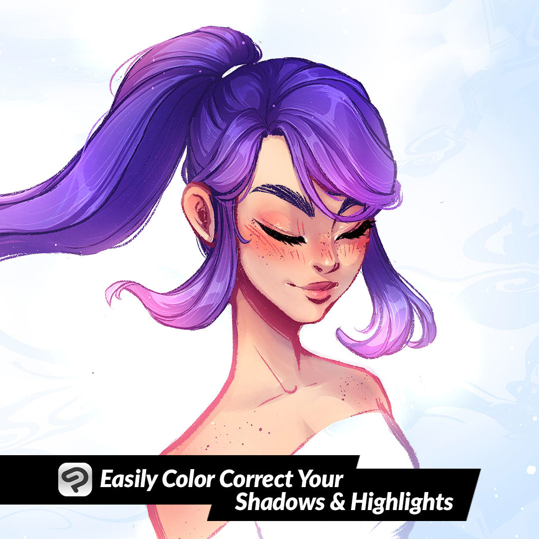
Easily Color Correct Your Shadows and Highlights
Contact Graphixly @
Hello! My name is Liz Staley and I’m a long-time user of Clip Studio Paint (I started using the program back when it was known as Manga Studio 4!). I was a beta-tester on the Manga Studio 5 program and for Clip Studio Paint, and I have written three books and several video courses about the program. Many of you probably know my name from those books, in fact. I write weekly posts on Graphixly.com and on CSP Tips, so be sure to come back every week to learn more Clip Studio Tips and Tricks from me!
So I was browsing YouTube a few days ago and was recommended this tip from the channel “LinesSensei” and I thought it was absolutely brilliant! I wanted to try it out and also see if I could expand on the tip a bit by extending it to the highlights of an image as well. If you have trouble making your shadows look natural then this is the tip for you! And it’s so insanely simple that it takes only a minute to make both your shadows and highlights look much better with Clip Studio Paint!
Let’s take a look!
So if you’ve looked at any advice for shading before you’ve definitely seen the advice to never shade your image with black. So most digital artists shade their images with a blue or purple color on a Multiply layer, as I’ve done in the image below.

As LinesSensei points out in their video, this technique can produce shadows that aren’t dark enough on dark areas (like the character on the left’s hair and jeans), and that they overpower lighter areas (such as the skin on the character on the right). It can also appear muddy on some colors as well. So we’re going to remedy this issue by using our flat color layer to adjust our shadows.
For this to work, your shadows will need to be all on the same multiply layer, and your flat colors will all need to be on one layer as well.
Select your flat color layer, then right-click on the layer in the layer palette and select “Duplicate Layer”.

Take the copy of the flat color layer and move it directly above your Shadow layer.

Now we need to adjust the color of this copy layer just a bit. Click Edit - Tonal Correction - Hue/Saturation/Luminosity. Take the hue down to around -15 or -20, and do the same for the Luminosity as well.

Once you’ve adjusted the Hue and Luminosity, right-click the layer in the Layers palette. Then go to Layer Settings - Clip to Layer Below. This will make our color control layer only show where it intersects with the shadow layer below it.

If you want more of the shading color layer to come through, lower the opacity on the flats copy layer.

Since I usually do my coloring with a highlights layer as well, I wanted to see if this would work for a lighter layer as well. Make another copy of the flat color layer and drag it above the highlights layer. Then adjust the Hue/Saturation/Luminosity but this time raise the Hue and Luminosity instead of lowering them.

Clip this adjustment layer to the Highlight layer. You may need to adjust the blending mode of the highlight layer. I decided on the Add blending mode. I love how this quickly changed all the highlights from drab yellow to looking appropriate to the color of the item!

On the left is the original version of my image and on the right is the new color adjusted version.

Conclusion
Huge thanks to LineSensei on YouTube for this tip! I really can’t believe I’ve never seen this before, it is very easy and makes it look like you hand-selected shading colors.
For more information on CLIP Studio Paint, please visit https://www.clipstudio.net/en or https://graphixly.com