Creating a Stylized Portrait
Contact Graphixly @
Hello! My name is Liz Staley and I’m a long-time user of Clip Studio Paint (I started using the program back when it was known as Manga Studio 4!). I was a beta-tester on the Manga Studio 5 program and for Clip Studio Paint, and I have written three books and several video courses about the program. Many of you probably know my name from those books, in fact. I write weekly posts on Graphixly.com and on CSP Tips, so be sure to come back every week to learn more Clip Studio Tips and Tricks from me!
Creating stylized portraits is not only a fun way to practice, but it can also be a quick idea for either online or convention commissions! Creating portraits can be a fun way to practice expressions, and make for great gifts. In this article, I will cover my personal process for drawing a stylized portrait and give some tips of what to look out for to create a likeness of the subject.
Let’s get drawing!
Creating a Stylized Portrait
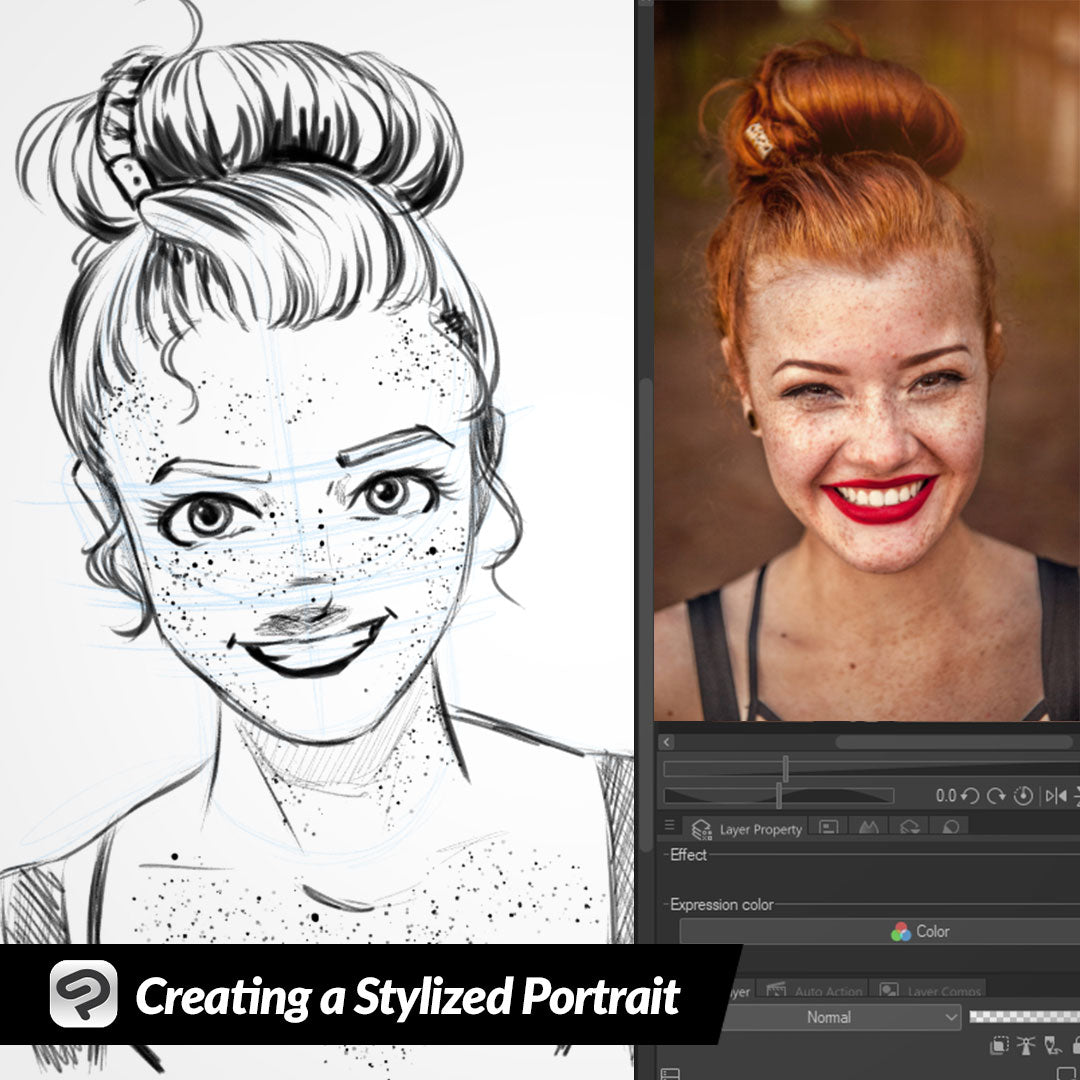
First of all, I start with a blank canvas in the size and dpi that I want. I found a photograph of a model from Unsplash (https://unsplash.com/photos/woman-taking-photo-while-showing-smile-u3WmDyKGsrY ) that I thought would be fun to draw and loaded it into the Sub View window so I can see it while I draw.

We need to have a good foundation for our portrait, so getting the overall head and feature position right is the first thing I consider when creating one. In the image I chose to draw from, the model is not quite straight on with the camera. The camera is looking slightly down on her, and her head is tilted a little bit to the left as well. I sketch out a rough shape of the head, and then put lines across roughly where the features will go so I can reference them as the drawing progresses.

Next I like to start trying to pick out the defining features of the portrait subject. The model I’ve chosen to draw from has a nice jawline, thin eyebrows, a radiant smile, strikingly beautiful eyes, and of course the huge amount of freckles! I usually start drawing any human face at the cheeks and chin so I can use them to position the rest of the features.
I’m not going for photographic realism, so I made the chin a little narrower in the drawing than in the photo. You can see that I’ve also made a light line where the hairline will go, and started drawing in the nose and the eyebrows. At this point I’m not going for perfection, just trying to rough in the features.

Next I sketched in the eyes and the mouth. Once I had these features in I could tell that the expression wasn’t right, as it looks more like a maniacal grin than the radiant smile of the reference image!

One of the things I love about digital art is the ability to scale, rotate, and push around lines without having to erase and redraw them. Using the lasso tool, I selected each eyebrow individually and then used the Scale/Rotate tool to rotate them slightly so that they aren’t as arched down into the middle of the face. I thought this helped considerably but something is still ‘off.’

After adjusting the eyebrows and looking between the drawing and reference some more, I decided that the eyes needed to be a lot smaller. I changed the shape of the eyes as well.

Cleaned up the sketch a little with the eraser because I am a messy sketcher! This way I can see the features a bit clearer. The model in the reference photo has some beautiful smile lines, but those can look strange on my style of cartoon drawings, so I added some small lines at the corners of the mouth to suggest the smile lines without making the face in the drawing look old.
At this point I also adjusted the shape of the nose as well.

When drawing the hair, I mentally break the hairstyle into large shapes. This works a lot better for me than trying to draw every strand of hair! Rough in the general shapes of the hair, then it’s easier to come back in and add more detail. In the image below I have colored the various shapes in the hair in different colors to illustrate my thought process for the sections of hair.

Don’t forget to add a few stray hairs for extra detail!

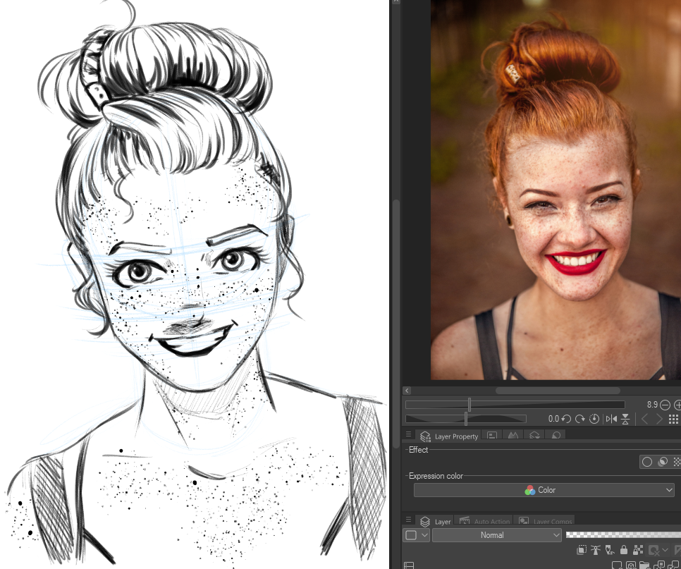
Now that I’m happy with the face and hair, it’s time to add some more details! I roughed in the neck and shoulders and the straps of the model’s top as well. If you are just doing a sketch portrait, don’t forget you can add some light hatching to add shading in certain areas, such as under the chin.

Now I like to add some more detail and shading to the hair and add finishing details. Because I’m working in Clip Studio Paint, I used a Freckles brush from CSP Assets to make adding the huge amount of freckles a breeze! I added some more shading in the hair and in the face, especially under the nose where a shadow would naturally be cast. Clean up any messy pencil marks and it’s done!

Conclusion
Creating stylized portraits can be a fun way to practice, create gifts, or offer as commissions to cosplayers at events! Make sure to look for the distinguishing features of your subject, such as expression, shape of the chin, and anything that makes the model unique. These will help your portrait be recognizable even with stylizing.
For more information on CLIP Studio Paint, please visit https://www.clipstudio.net/en or https://graphixly.com