Creating a Lineless Illustration
Contact Graphixly @
Hello! My name is Liz Staley and I’m a long-time user of Clip Studio Paint (I started using the program back when it was known as Manga Studio 4!). I was a beta-tester on the Manga Studio 5 program and for Clip Studio Paint, and I have written three books and several video courses about the program. Many of you probably know my name from those books, in fact. I write weekly posts on Graphixly.com and on CSP Tips, so be sure to come back every week to learn more Clip Studio Tips and Tricks from me!
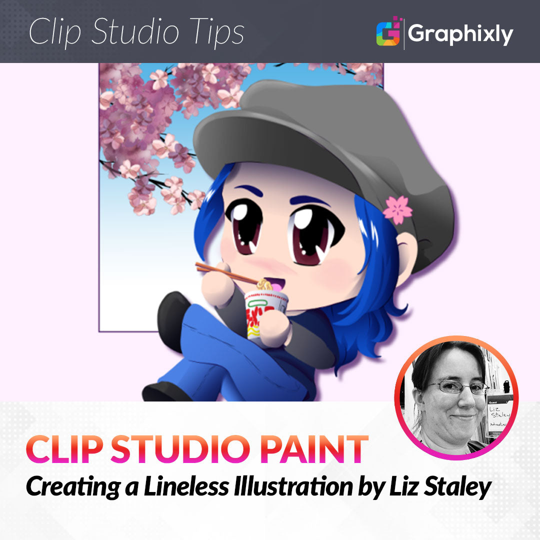
It’s no secret that lineart is one of my favorite steps of my art process. However, sometimes it can be fun to do something a bit different. So this week let’s create a “lineless” illustration using Clip Studio Paint!
In this article we will cover the following topics:
Setting Up
Lasso Marquee Tool
Adding Shading with Gradients
Vector Layer
Finishing Up
Let’s get drawing!
Setting Up
Of course before we can finish an entire illustration, we need to know what we’re going to be drawing! I used a chibi pose idea from this CSP Asset: https://assets.clip-studio.com/en-us/detail?id=1963583 to get me started, then changed it from the character holding a ball (or maybe eating a dumpling?) to eating some instant ramen with chopsticks instead.
Once I had my sketch cleaned up, I took the sketch layer and set it to 25% opacity. I will be creating all my color layers BELOW this layer so that the sketch lines are visible while working.

Now let’s start on adding the colors to our drawing!
Lasso Marquee Tool
For most of this drawing I actually make the shapes with my favorite pen tool. However, I thought I would show a few alternate methods to creating the shapes as well for those who aren’t as comfortable with drawing tools or who have issues with getting smooth lines.
So to start off, let’s use the Lasso Marquee tool to create a selection of the face area of the drawing. I carefully traced around the face of my sketch, not worrying about accuracy in areas where the skin will be covered with other things (like the hair, hat, etc) but making sure to be careful around areas like the cheek.

Select the color you want to fill the area in with, then click on the “paint bucket” icon to fill. Continue with all areas you wish to fill on the current layer.
I did all my “skin” areas on one layer, but later in the drawing I was really wishing I’d made the hands on separate layers. Make sure to think about the pieces that overlap in your drawing and how they might need to be layered to make things easier as you continue. I realized while working that if I’d put the hands on separate layers then creating the chopsticks and the ramen container would have been easier.

Adding Shading with Gradients
Before we get into another method for creating your blocks of color, I do want to add some shading to this drawing as I go along. Since I’m going for a lineless look and not a “flat” look, I want to add shading to make it look more finished and not like it’s just cut out pieces of paper (though that is a style that can be fun to do!)
So, with my skin areas all done on one layer, I will click on the “Lock Transparent Pixels” icon in the Layer palette, shown in the red square below.

This will ensure that we can only make changes on the areas of this layer that already have pixels filled in.
Next, select the “Foreground to transparent” gradient tool. Then, in the lower right corner of the Tool Property window click on the small wrench icon to open the Sub Tool Detail window.
Under the “Ink” category of settings, change the Opacity to around 50% (less if you want to be able to build the gradients up more slowly, more if you want them to be darker faster). Then set the Blending Mode to Multiply.

Close the Sub Tool Detail window.
Next use the lasso marquee tool to select an area where you want to shade on your layer. Then use the gradient tool and a shading color such as a dark blue or purple to add a gradient to the area. In the example below, I added shading under the brim of the hat, to the center of the ear, the neck, and the hands. These shadows will help add dimension and visually separate the parts of the image since there are no lines to separate them.

If you have a hard line between the base color and the gradient somewhere, you can use the Blend tool to blend out the color. I did this with the shadow under the brim of the hat.
Every once in a while, turn off the sketch layer to see how your illustration is looking without the lines.

Shading on this character’s hair was important to keep it looking like hair and not a blue mass on the head! The hair was done on two separate layers - one for the bangs and one for the hair on the back of the head. Then I used the same selection and gradient process to add the shading.

Vector Layer
If you have trouble using the selection tools or pen tool accurately, it is possible to do this process using vector layers to get the shape of the area blocked out. Because the hat has a very smooth and long curve on the brim, I opted to use a vector layer so I could make sure that area looked as sharp as possible.
Create a new vector layer, then you can use the figure, curve, or line tools to make your shapes. I used the same pen tool I’ve been using to make a basic line, then used the “Simplify vector line” subtool under the Correct Line category to lessen the number of control points. Then I moved the control points around until I was happy with the curve of the line.

I used this process to create the entire outline of the hat.

Once the shape is complete, right-click on the vector layer in the layer window and select “Rasterize” from the menu. This will turn the vector layer into a raster layer.

Now you can fill the shape with your color using the Fill tool.
For more information about using vector layers in CSP, check out this tutorial I wrote on the subject: https://tips.clip-studio.com/en-us/articles/5830
Finishing Up
Continuing using the above steps, I went around and created all the various shapes and layers for each part of the drawing, making sure that each element was on its own layer.
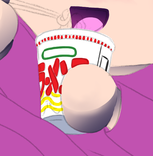
The ramen cup was done with all the colors on one layer to make the shading easier. Since the ramen cup was white, I also changed the default “paper” layer in my CSP file to an obnoxiously bright color so I could see what I was doing.

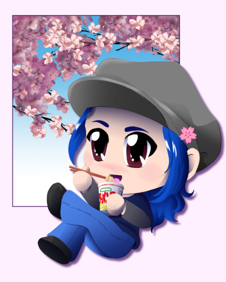
Here’s the illustration with a little background element behind it.

I did decide at this point that I wanted to add a drop shadow to the character to make her “pop” off the background a bit and add some more dimension. To do that, I turned off all the background layers, including the Paper layer, so that I just had the character and a transparent background. Then right-click one of the visible layers and select “Merge visible to new layer” from the menu.

This will make a flat copy of all the visible layers on a new layer. I moved this layer to below the figure but above the background and selected the “Lock transparent pixels” option. I also turned the background layers back on.
I renamed the merged copy layer of the character to “shadow”, then filled it with a dark purple color. Since the transparent pixels were locked, the shape of the character should now be filled with the shadow color.
Then I selected the move tool and used the arrow keys on my keyboard to move the layer down and to the right just a little to make a drop shadow.

Once I had the shadow in the position that I liked, I turned off the Lock Transparent Pixels on the layer and then ran the Gaussian Blur filter to blur the edges a little bit.
For a final touch I added some white shine to the hair and a few other little details.

And it’s done!
Conclusion
This was a new way to think about creating and a fun challenge. There are so many ways to get this look and this is just one of them. Try it out if you’re inspired and looking for a little challenge!
For more information on CLIP Studio Paint, please visit https://www.clipstudio.net/en or https://graphixly.com