Checking Contrast with Correction Layers
Contact Graphixly @
Hello! My name is Liz Staley and I’m a long-time user of Clip Studio Paint (I started using the program back when it was known as Manga Studio 4!). I was a beta-tester on the Manga Studio 5 program and for Clip Studio Paint, and I have written three books and several video courses about the program. Many of you probably know my name from those books, in fact. I write weekly posts on Graphixly.com and on CSP Tips, so be sure to come back every week to learn more Clip Studio Tips and Tricks from me!
In a recent article I mentioned using adjustment layers to check the contrast of your illustrations as you work on them but did not go into the process. So this week, let’s talk about contrast, why it’s important, and how to easily check your contrast with a simple adjustment layer!
In this article we will cover the following topics:
Setting Up A Correction Layer
Methods for Adjusting Contrast
Let’s get started!
Setting Up A Correction Layer
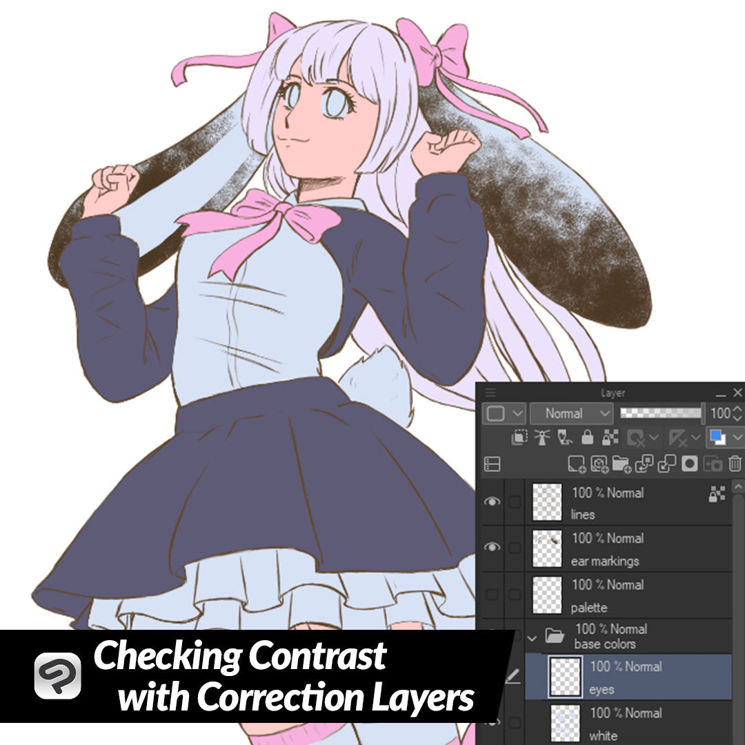
To make adjusting my mid tone colors for this illustration easier after checking contrast between them, I put each color for my character on its own layer. This is a more time consuming process than putting them all on one layer, but it makes it much easier to change one color without affecting the others.
To check the contrast between our flat colors, we are going to create a new Correction Layer that will show our image in grayscale. Click on Layer - New Correction Layer - Hue/Saturation/Luminosity.
In the Hue/Saturation/Luminosity options, drag the Saturation slider all the way to the left so that it is at -100.
Click OK to create the Correction Layer. Drag the correction layer to the top of the layer stack if it is not there already.
The benefit of creating this correction layer is that we can turn the visibility of it on to check the contrast in grayscale, then turn it off to adjust our image, then turn it back on to check again. This is a non-destructive way to check our contrast instead of using the Hue/Saturation/Luminosity adjustment on the entire image each time we want to check the grayscale version.
When in grayscale it is much easier to tell if the contrast between colors, shadows, and highlights is high enough to make all areas of the character distinct and to make sure there is enough shading to make your illustration look dynamic and “3D”.
Methods for Adjusting Contrast
By looking at the grayscale version of my illustration with the Correction Layer turned on, I can see that some of my mid tone colors are too similar. The skin, hair, and the “white” areas (which are really a light gray-blue so that white highlights will show when I do the shading) are very similar in tone, making them hard to distinguish from one another.
To change the tone of the skin, I’m going to select the Skin layer, then click on the “Lock Transparent Pixels” icon in the layer palette, shown below. You can see which layers have the transparency locked by the icon showing to the right of the layer name.
This feature makes it so that only the non-transparent pixels of this layer can be changed. Now to change the skin tone we can select a new color and then use the Fill tool in the shortcut bar at the top of the Clip Studio Paint interface to change the color of the layer in one click!
Now that the skin tone is adjusted, let’s turn the visibility of our Correction Layer on and take another look at the grayscale version. Now there is more contrast between the skin, hair, and the white area of the clothes but the contrast could still be improved.
I’m going to select my White color layer (which is actually a light bluish-grey so that white highlighting will show). This time, let’s adjust the color by going to Edit - Tonal Correction - Brightness/Contrast.
I’m going to take the Brightness up on this layer to make the white base color lighter.
Now I want to adjust the hair a bit as well since its tone was also too close to other colors and now that I’ve adjusted those colors I don’t care for the original color I chose for it. This time, let’s use the Edit - Tonal Correction - Hue/Saturation/Luminosity option. Using this I can even change the hair to an entirely different color instead of just changing the lightness or darkness!
Now with the adjustments made let’s turn on the visibility of the correction layer again and check that the contrast between the flat colors is good.
Each area is easy to distinguish from the others, which is a great start! Now I can start shading and highlighting this illustration, and will continue to check the contrast using the Correction Layer as I go.
Conclusion
This is just one of the many uses for Correction Layers, but it can be one of the most useful for starting your illustration off on the right foot and getting your contrast clear from the start.
For more information on CLIP Studio Paint, please visit https://www.clipstudio.net/en or https://graphixly.com